Derek Love is a designer based in New York. He combines visual and verbal design, rooted in research, to craft authentic and unified narratives for commercial and cultural entities.
Reductionism and purity of expression guide Derek’s practice. He focuses on creating sustainable work that moves beyond passing trends. His work spans brand strategy, identity, and experience.
He has been recognized by Communication Arts, Graphis, and Print Magazine, and received the Steven Heller Design Research Award. He has also judged for the Art Directors Club.
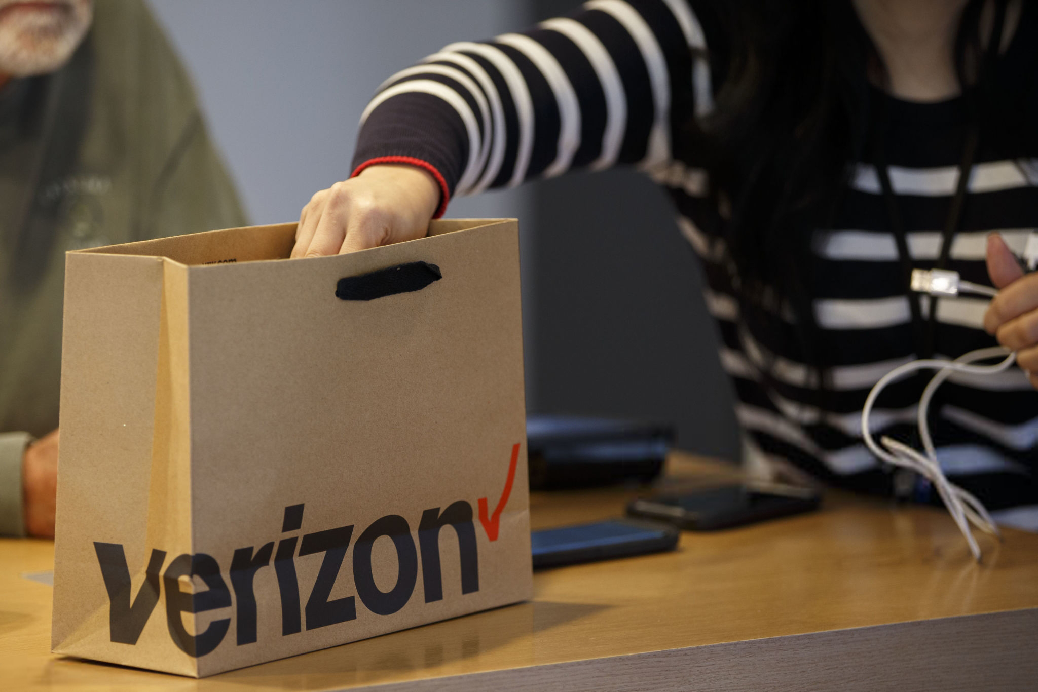
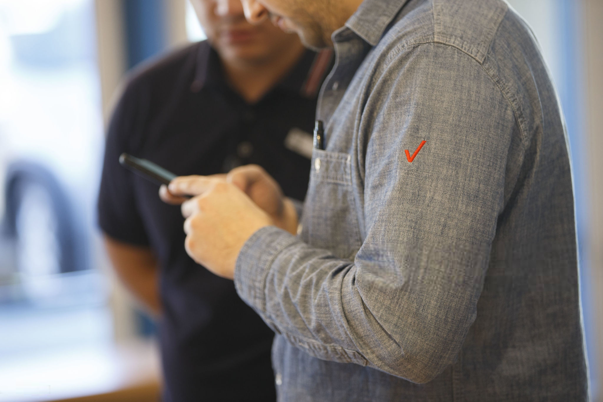
Since 2017, he has led brand activations, retail experiences, and cross-platform campaigns as senior creative director at Verizon, where he leads a team of 20 creative practitioners.
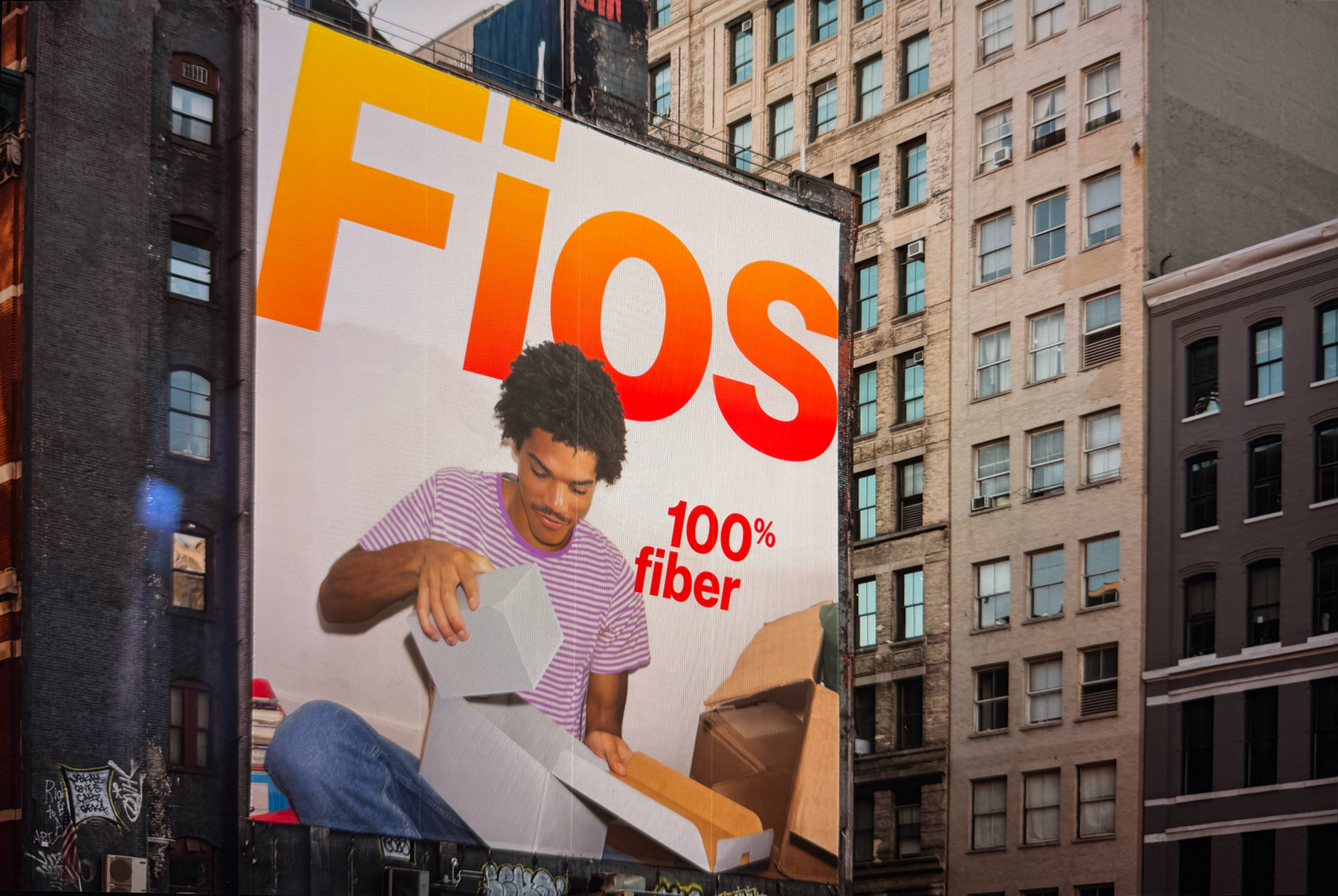
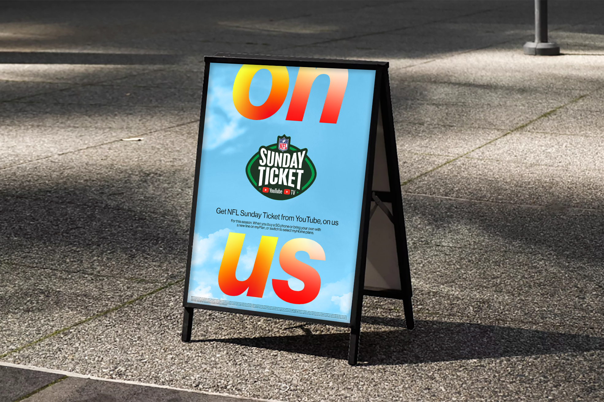
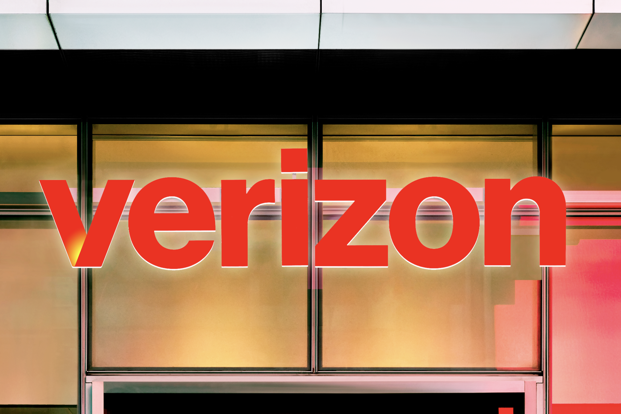
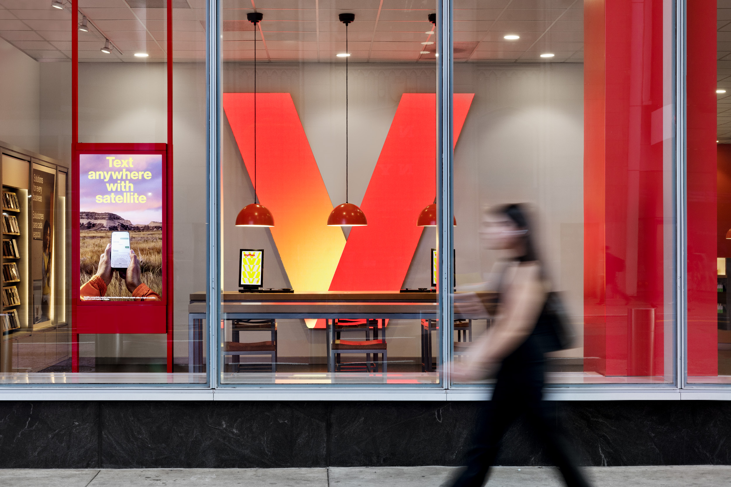
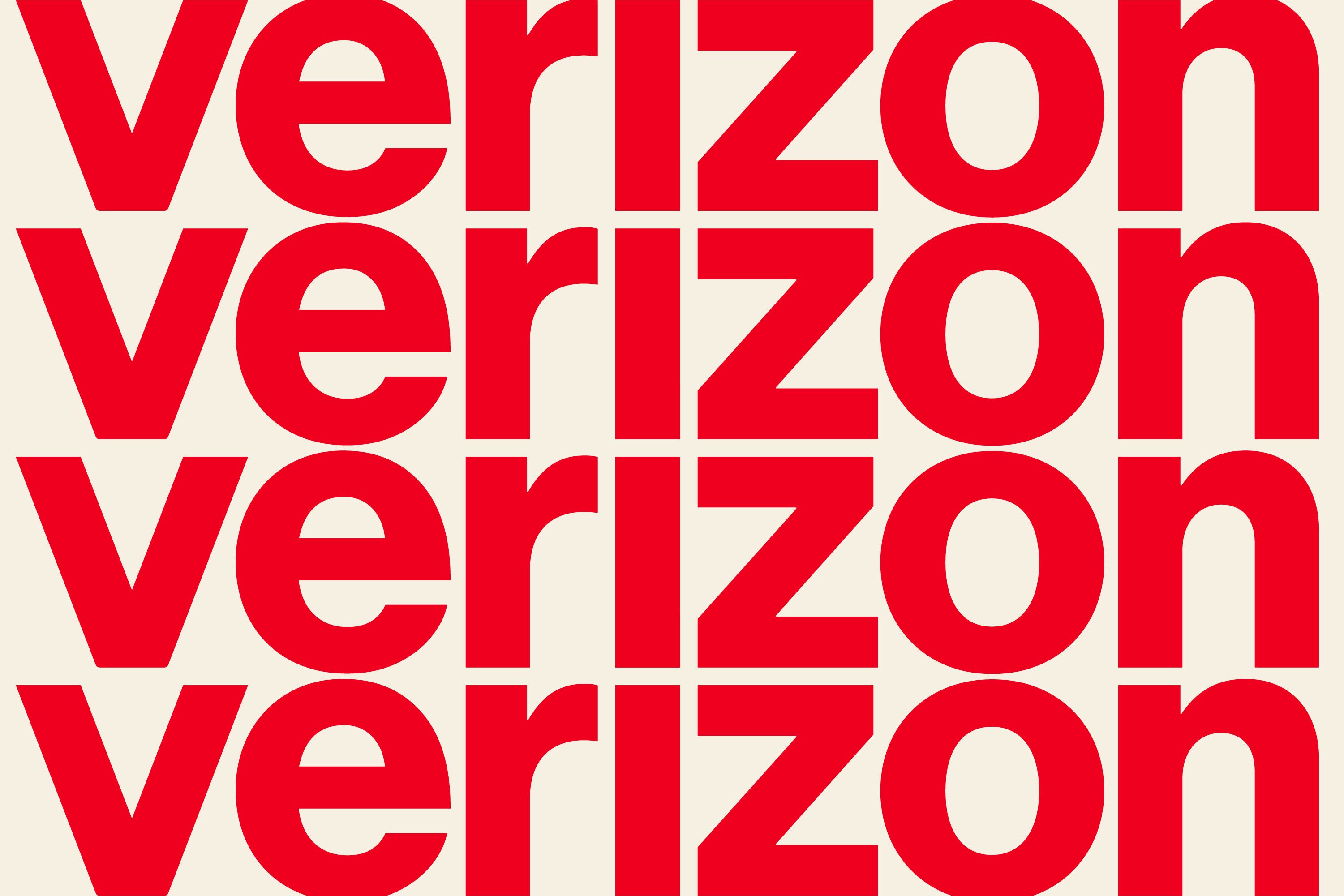
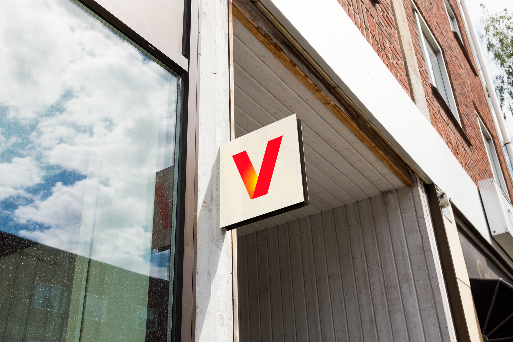
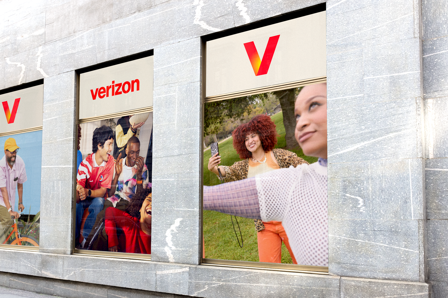
Design system, photography, and campaign materials that unify Verizon’s product, retail, and digital communications.
The work gives the brand one clear voice across every touchpoint. It makes information easier to understand and helps people move through product stories without effort. Color brings warmth without overwhelming the message. Photography stays grounded in real people and real products. Portraits feel open. Product images stay direct. The system adapts to scale and context but holds its shape. Type remains quiet so images and color carry the story.
Studio: Verizon; In collaboration with: Turner Duckworth; Vice President, Creative: Guto Andrade; Senior Creative Director: Derek Love; Design Lead: Serom Lee; Portrait photography: Jane Smith; Product photography: Boon Chian Ong; Typeface: Neue Haas Grotesk; Year: 2025.
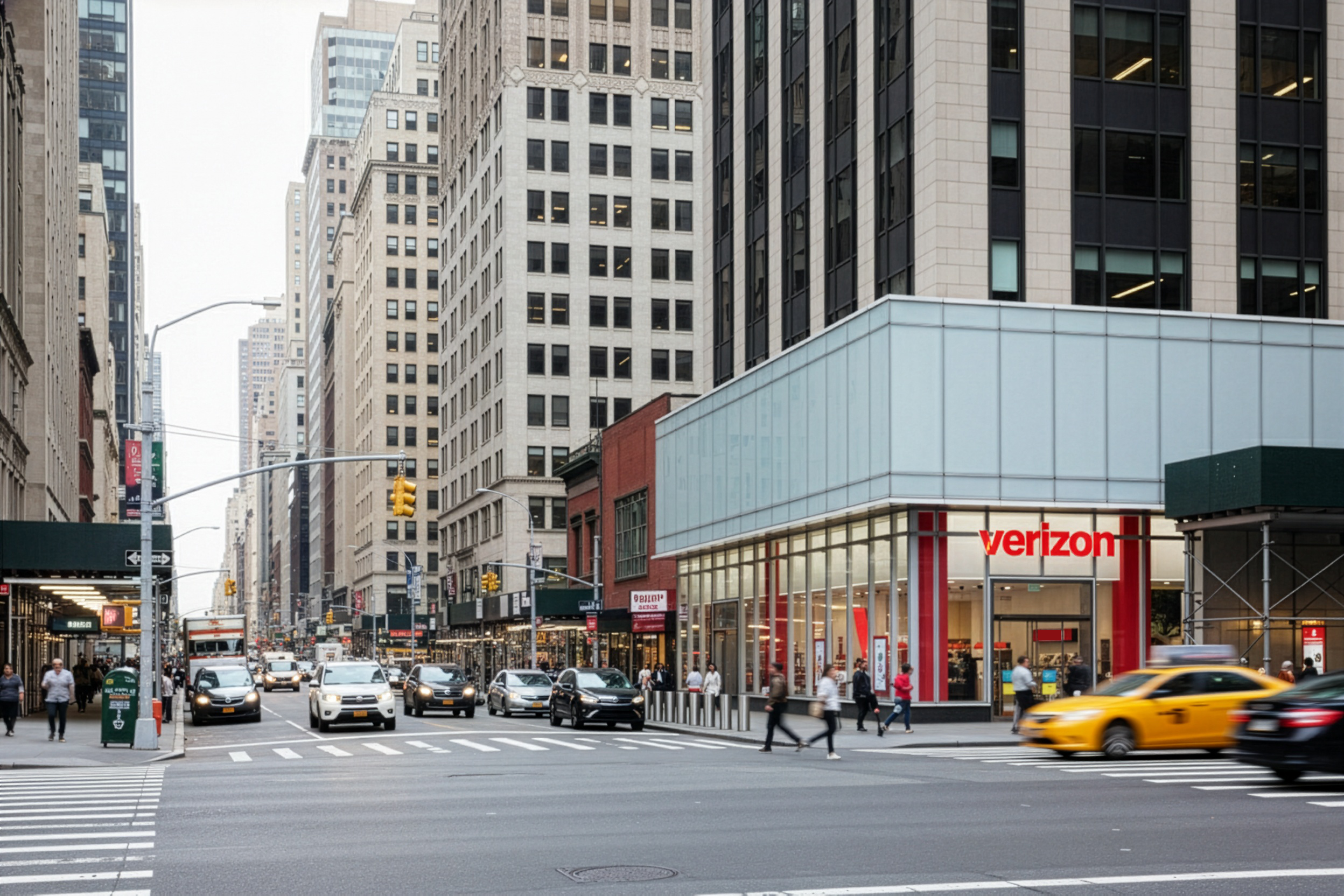
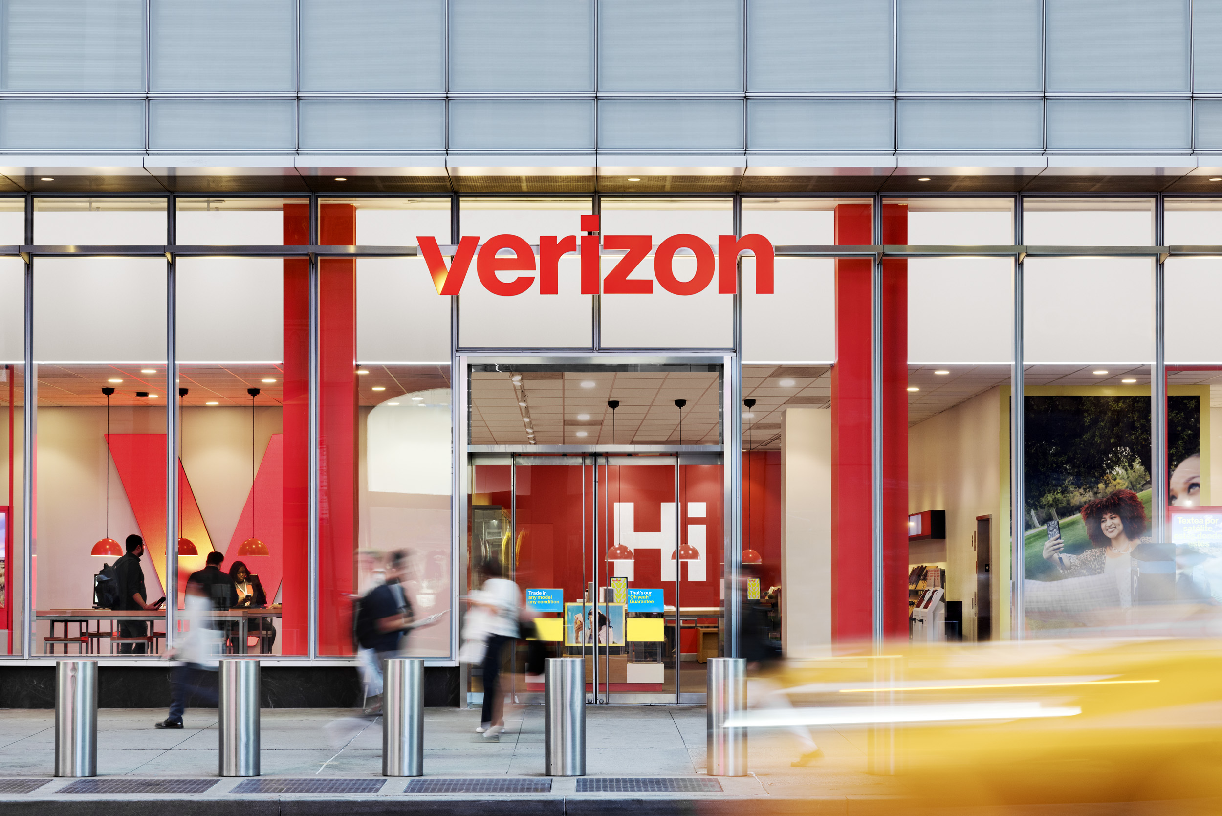
A comprehensive brand relaunch across identity, visual and verbal design, motion, interactive, retail, and campaign. The work marked a shift away from a corporate tone toward something warmer and more alive. Color became the anchor. The V carries a glowing gradient that works inside the full wordmark or on its own. It brings back the sense of electricity that shaped earlier versions of the brand.
Neue Haas Grotesk stays in place. Red leads the palette. Soft tones of stone and yellow support it. The glow on the V creates a clear focal point and ties the system together. The identity feels brighter, more immediate, and still grounded in the brand’s history. The relaunch draws from Verizon’s heritage and turns it into something more vibrant. It reflects the experience of life powered by what Verizon offers.
Studio: Verizon; In collaboration with: Turner Duckworth; Chief Marketing Officer: Leslie Berland; Vice Presidents, Creative: Ricardo Aspiazu, Mike Wente; Senior Creative Director: Derek Love; Photography by Boon Chian Ong and Connie Zhou; Typeface: Neue Haas Grotesk; Year: 2024.
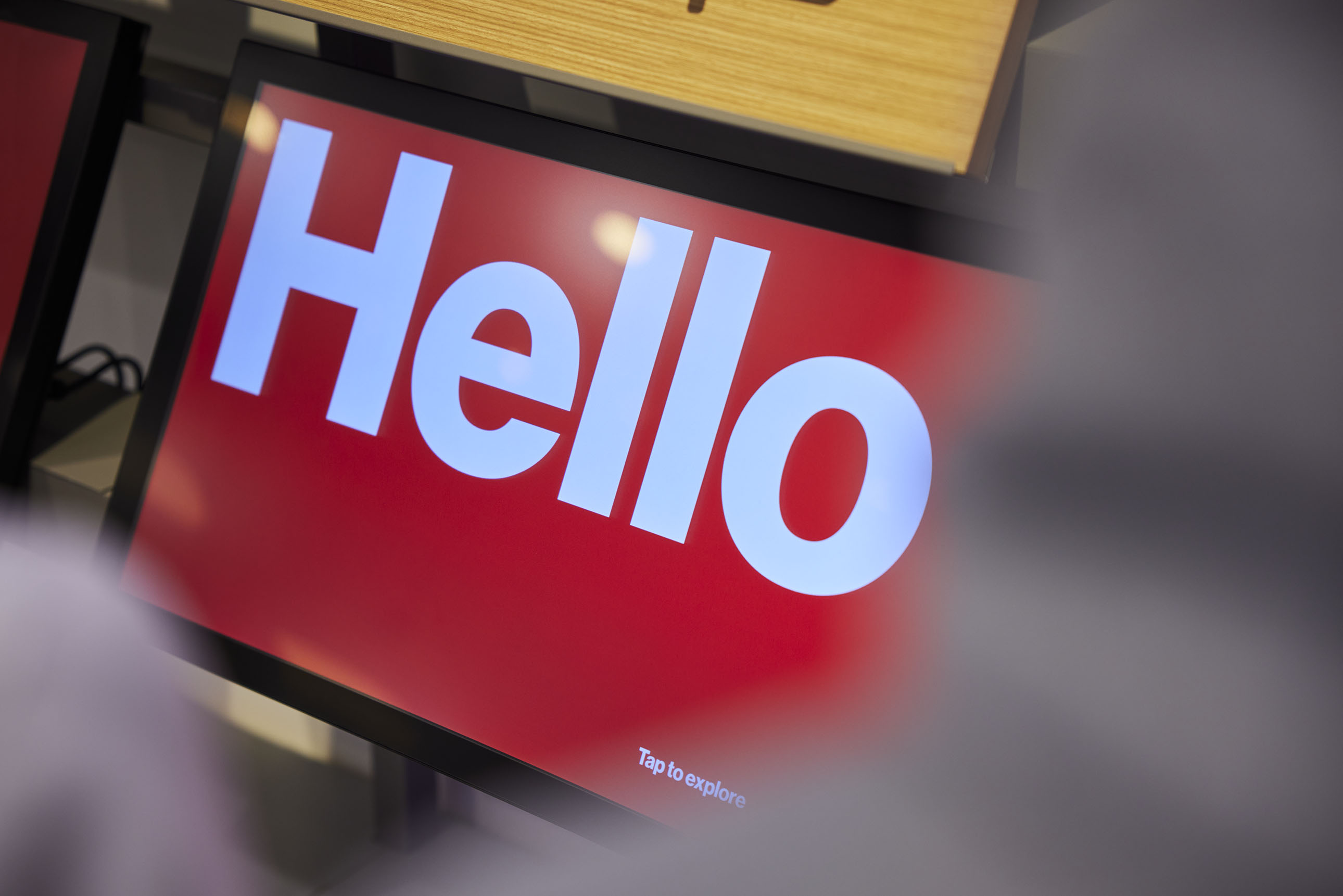
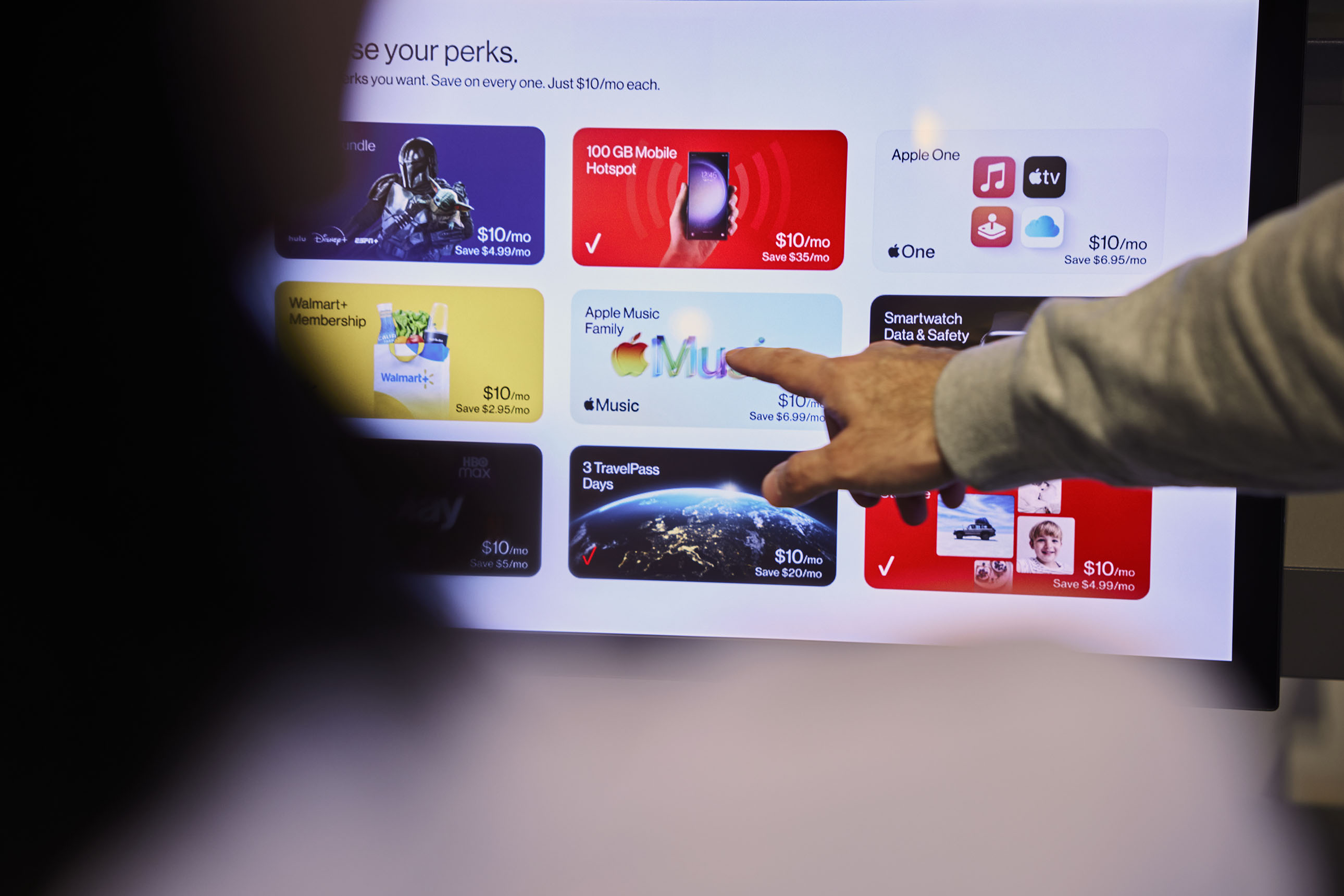
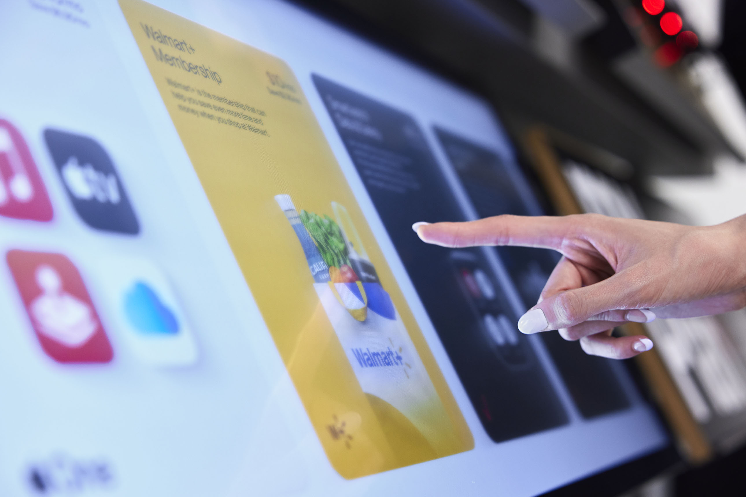
An interactive design system unifying digital customer experiences across retail, web, and app. The aim was to bring all in store experiences into one clear structure. The system had to feel simple to use and simple to maintain.
The work is supported by a strong component library and a set of standards that designers can rely on. This streamlines the design process and creates a more consistent experience for customers. The system also sets a solid base for future updates. Elemental changes flow across the entire framework, from color to grid to type to motion. The goal is steady. Create an intuitive experience no matter where someone meets a Verizon digital product.
Studio: Verizon; Chief Marketing Officer: Diego Scotti; Senior Creative Director: Derek Love; Associate Creative Director: Minhwan Kim; Interaction Designers: Dharini Perera, Gowoon Park; Typeface: Neue Haas Grotesk; Year: 2023.
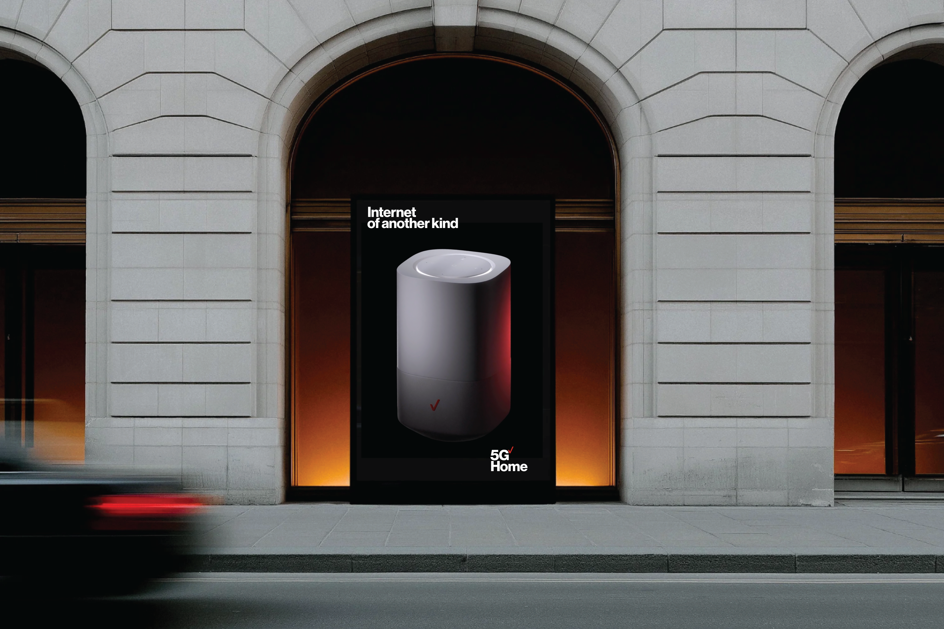
Art direction, motion design, and spatial design for the launch of Verizon 5G Home Internet.
The product sits on Verizon’s advanced 5G network and was introduced with a new router designed to feel like a quiet object in the home. It blends into any space and becomes connective tissue for daily life. The communications focused on simplicity and power. “5G Home has landed” carried a sense of newness and suggested something almost otherworldly. The work highlighted speed, reliability, and ease of use. The tone stayed clean and modern. The design underscored the technology without turning it into spectacle.
Studio: Verizon; Chief Creative Officer: Andrew McKechnie; Senior Creative Director: Derek Love; Associate Creative Director: Marvin de Jong; Designer: Kyla Arsadjaja; Motion: Bryce Barros; Animation: Buck; Typeface: Neue Haas Grotesk; Year: 2021.
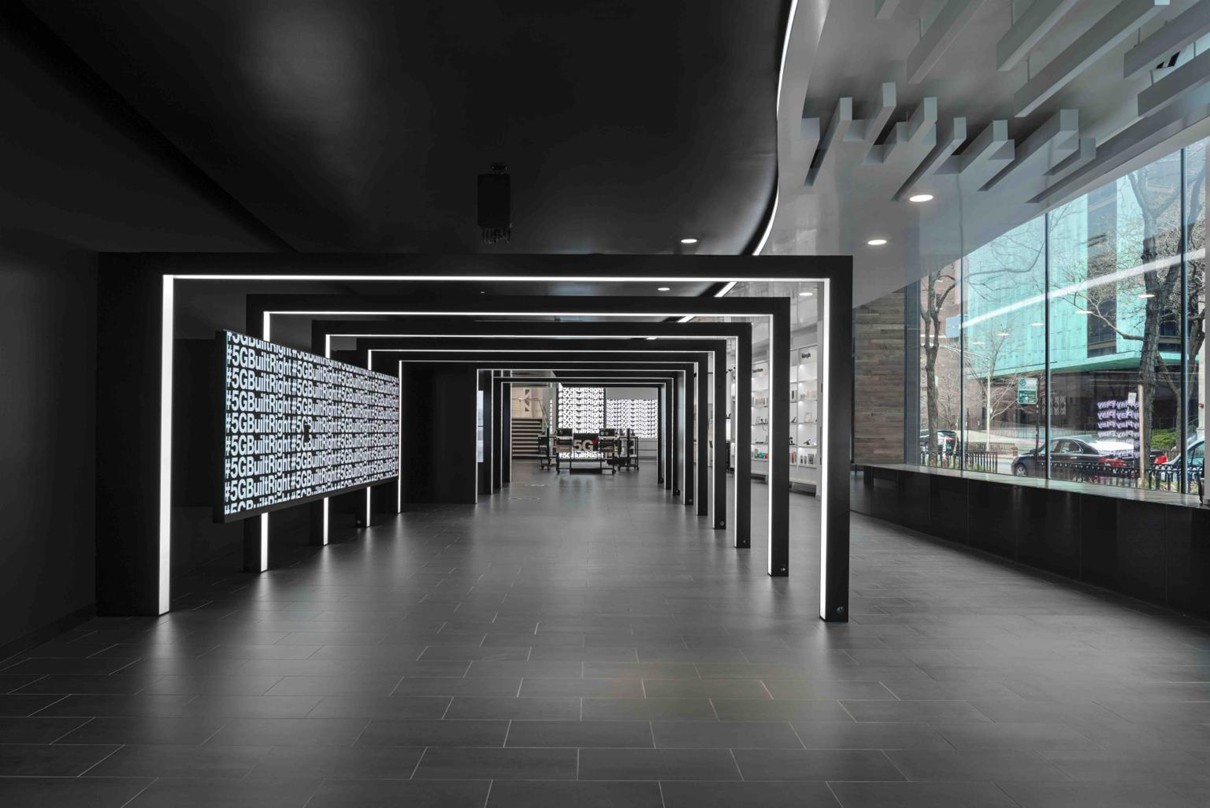
Pop up design, motion, and environmental graphics created with architectural partners to turn a raw space in Chicago into a place for engagement. The idea was to give form to something people could not yet see. 5G was still emerging. This pop up let customers touch the technology and understand its real use cases.
The work shaped a new way to use video in stores. Motion activated displays, focused audio moments, AR touchpoints, voice activation, and large scale motion graphics played beside quieter lifestyle scenes. The aim was to guide people through the space and give the technology a human pace.
Studio: Verizon; Chief Creative Officer: Andrew McKechnie; Senior Creative Director: Derek Love; Associate Creative Director: Marvin de Jong; Copywriter: Michael Dougherty; Designer: Ilya Yavnoshan; Motion: Bryce Barros; Typeface: Neue Haas Grotesk; Years: 2019 to 2020.
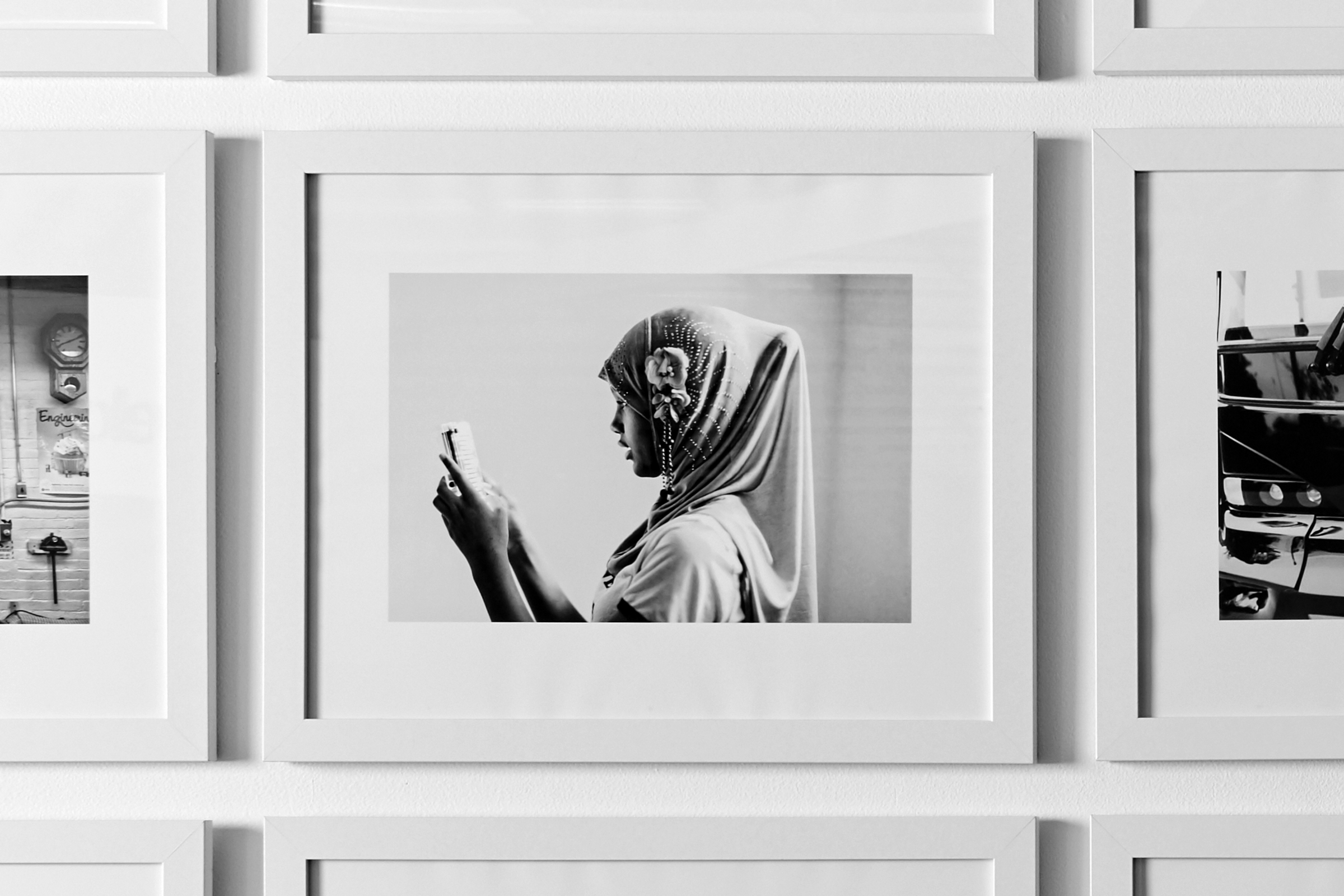
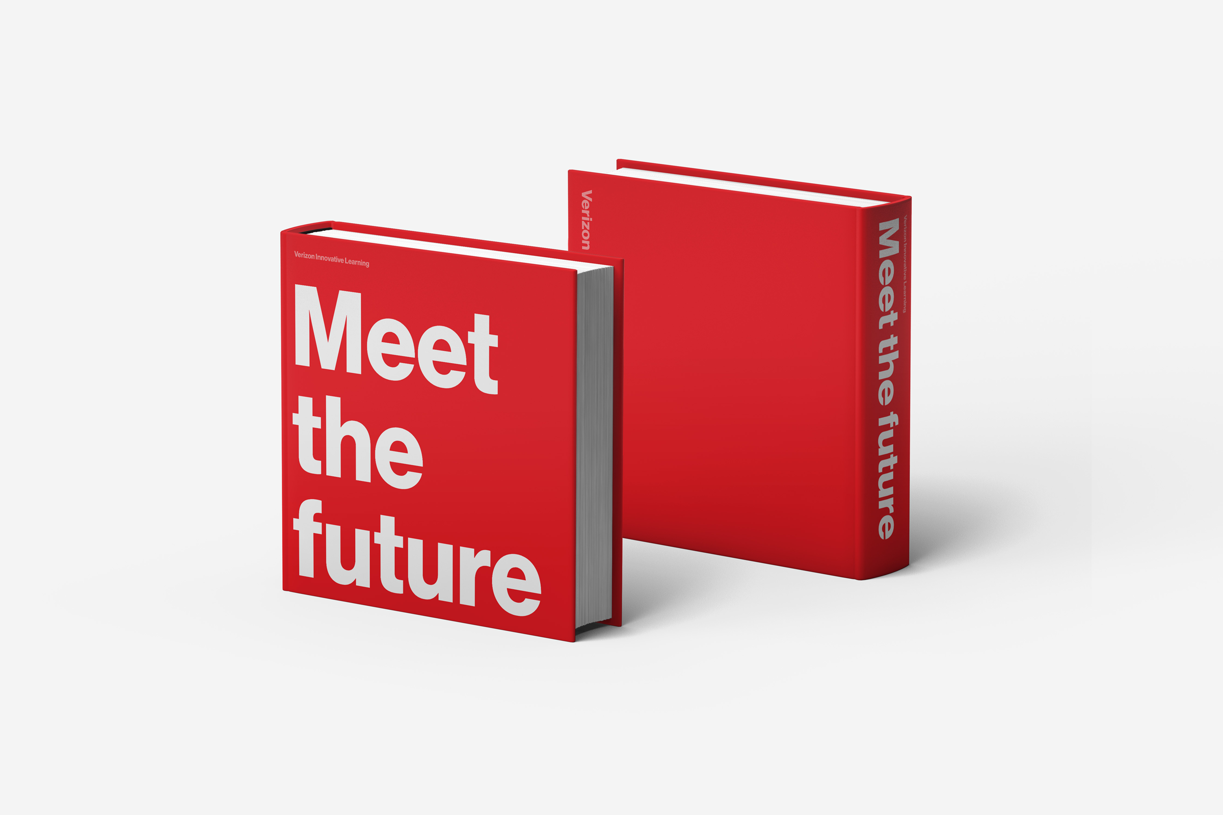
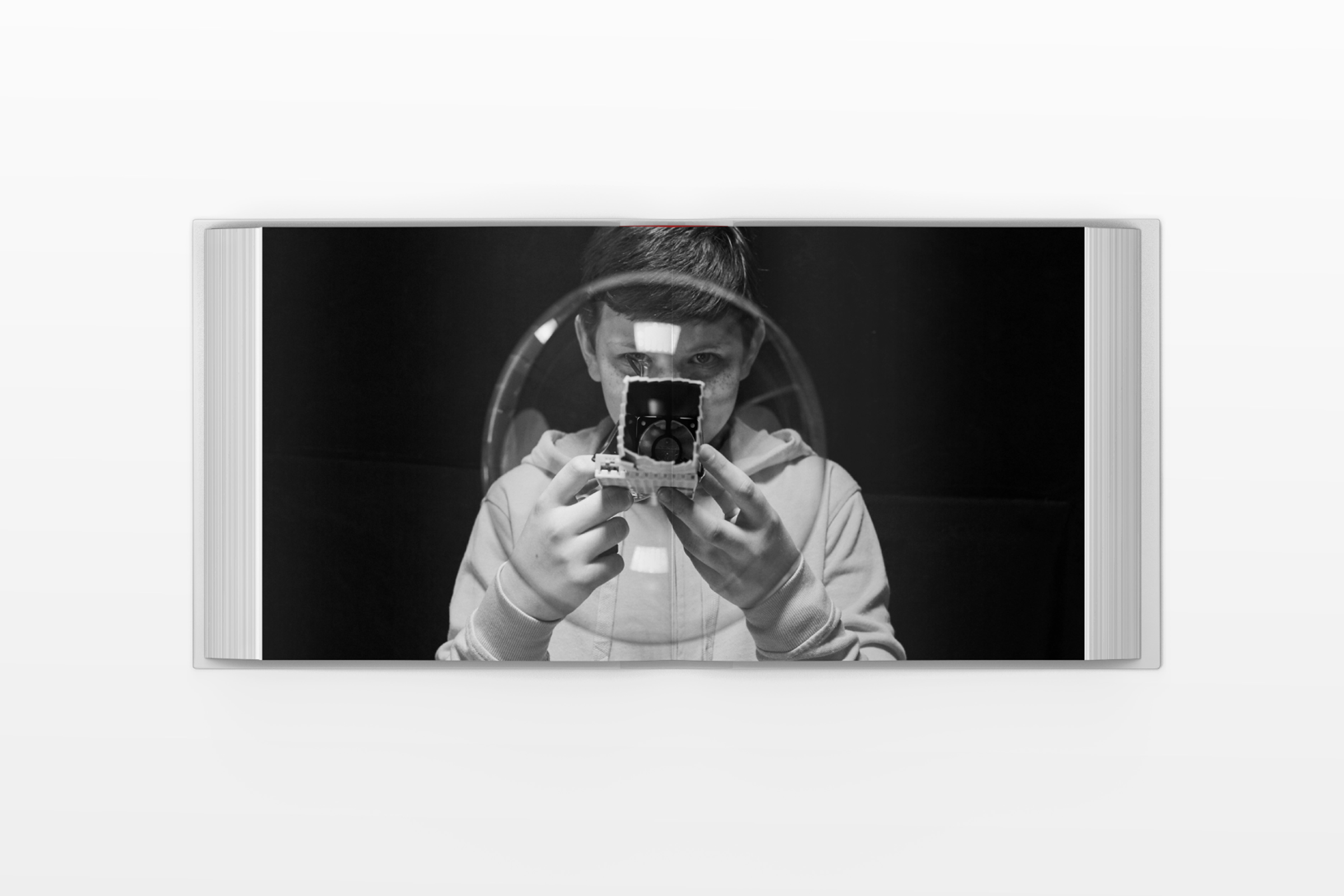
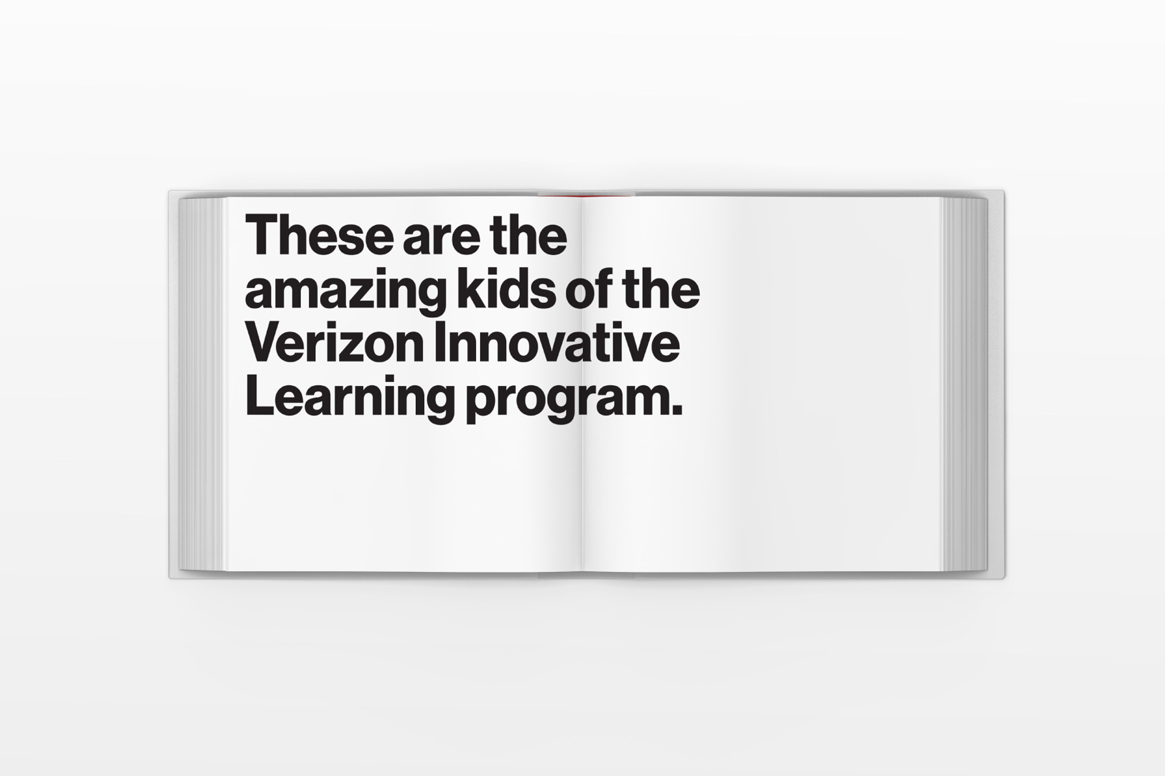
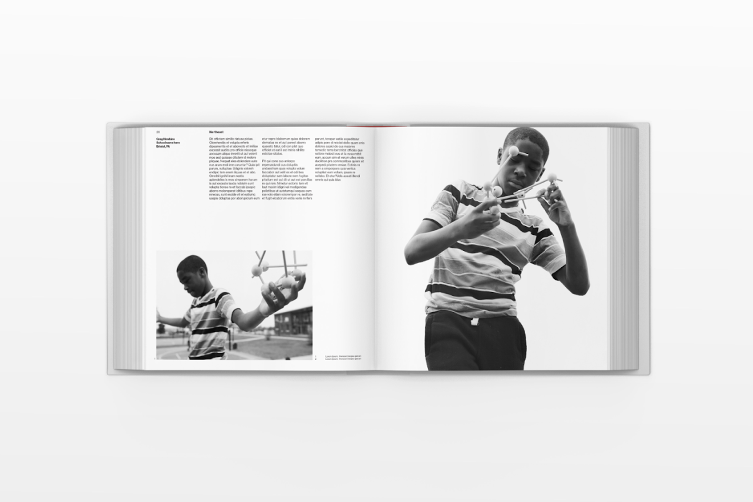
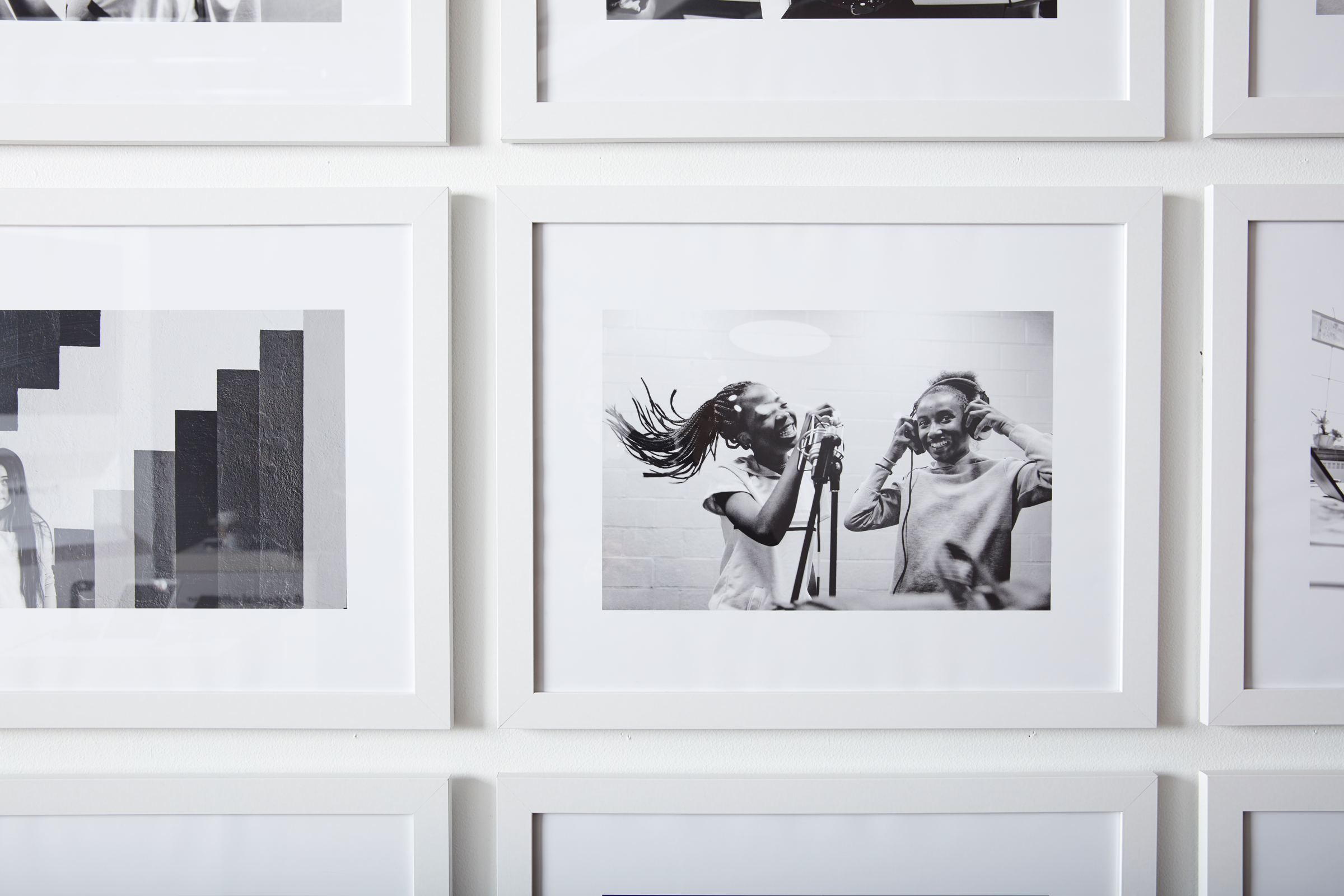
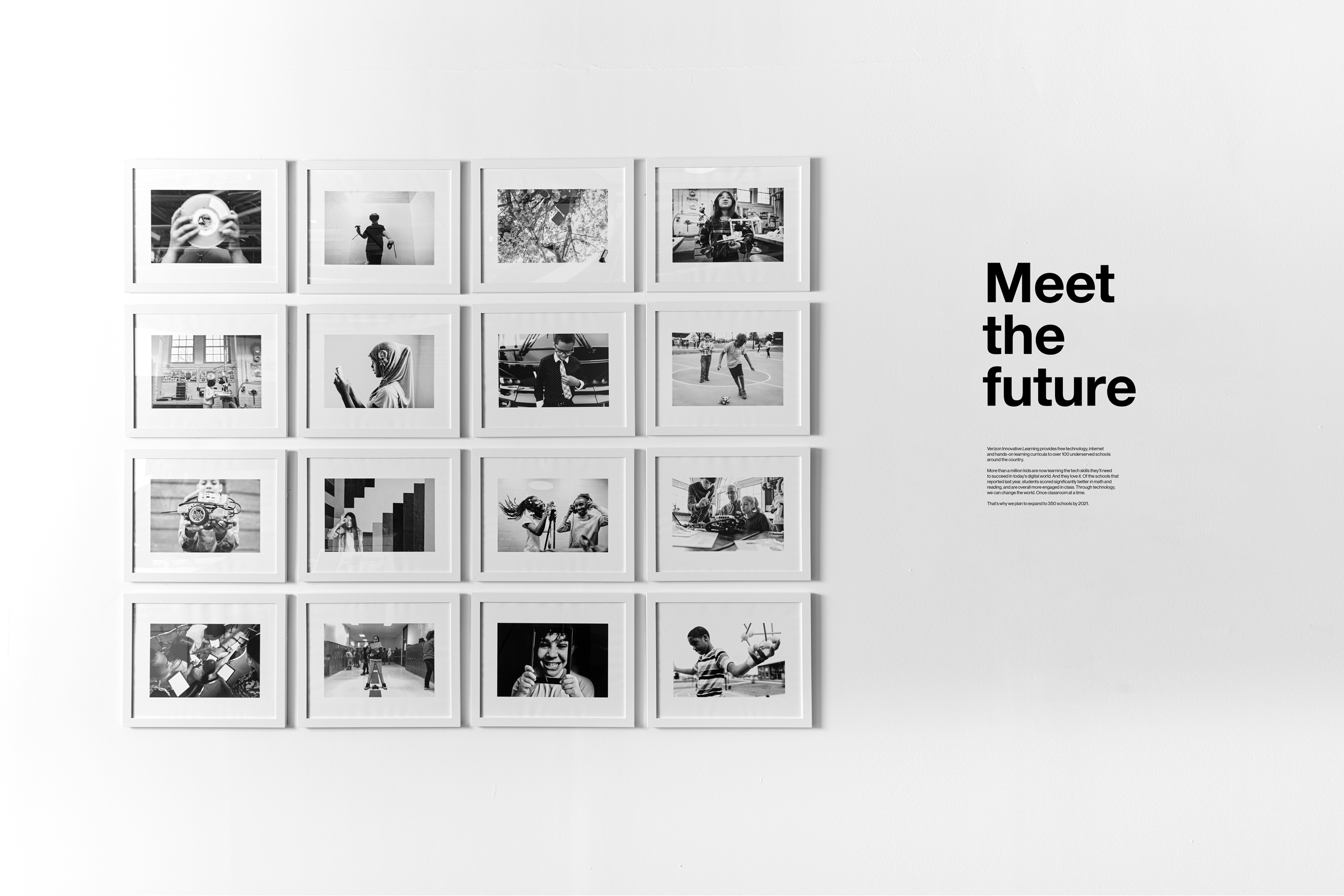
Brand strategy, identity, publication design, and environmental graphics shaped the story of Verizon Innovative Learning. The work connects social responsibility with a clear mission to close the digital divide in education. The program aims to bring digital skills to ten million young people by 2030.
Calm, poetic photography shares the lives of real students. Their stories sit inside retail spaces and extend into a publication that follows their growth and achievements. The program builds confidence and sparks curiosity in young learners. Research shows stronger engagement in school. Students explore robotics, 3D printing, engineering, coding, artificial intelligence, and AR and VR, often in schools where most students qualify for reduced lunch.
Studio: Verizon; Chief Marketing Officer: Diego Scotti; Chief Creative Officer: Andrew McKechnie; Creative Director: Derek Love; Designers: Sara Cykiert, Sung Mun, Melissa Yu; Typeface: Neue Haas Grotesk; Year: 2019.
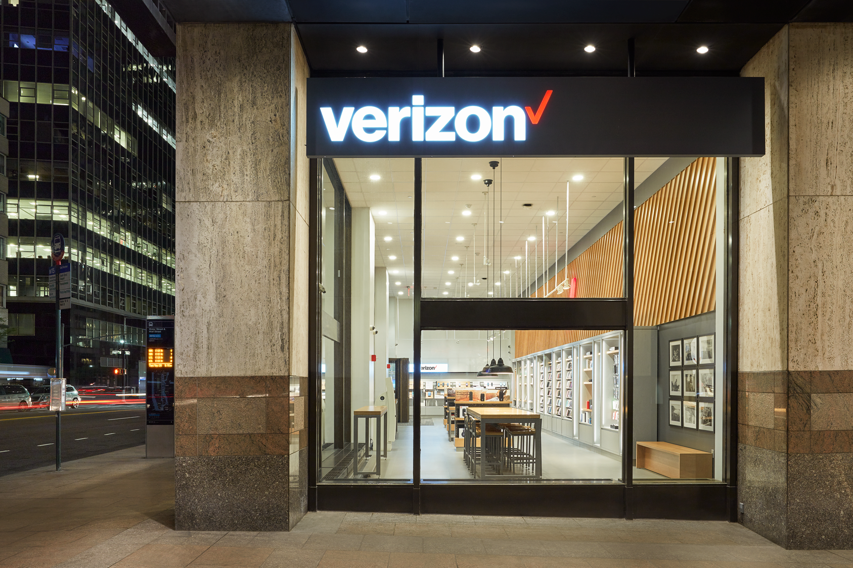
Spatial design, environmental branding, and wayfinding for a simplified retail experience introduced after Verizon’s 2015 brand refresh. As the sixth largest retailer in the United States, the company needed a setting that made technology feel more human and approachable. The concept borrowed the quiet order of a bookstore to shape a browsing friendly environment.
Phones were presented like magazines, and categories shifted from specs to lifestyle needs. Material choices deepened that feeling. Wood and sustainable surfaces grounded the space. The layout encouraged people to wander and discover. The experience prioritized clarity over spectacle and moved the store toward something calmer and easier to navigate.
Studio: Verizon; Chief Marketing Officer: Diego Scotti; Senior Director: Kambiz Hemati; Creative Directors: Ric Edwards, Derek Love; Typeface: Neue Haas Grotesk; Years: 2017 to 2018.
Before joining Verizon, Derek worked at Pentagram, leading branding projects across fashion, technology, and cultural institutions. His work combined strategic clarity with distinctive design to create identities that stand out and endure.
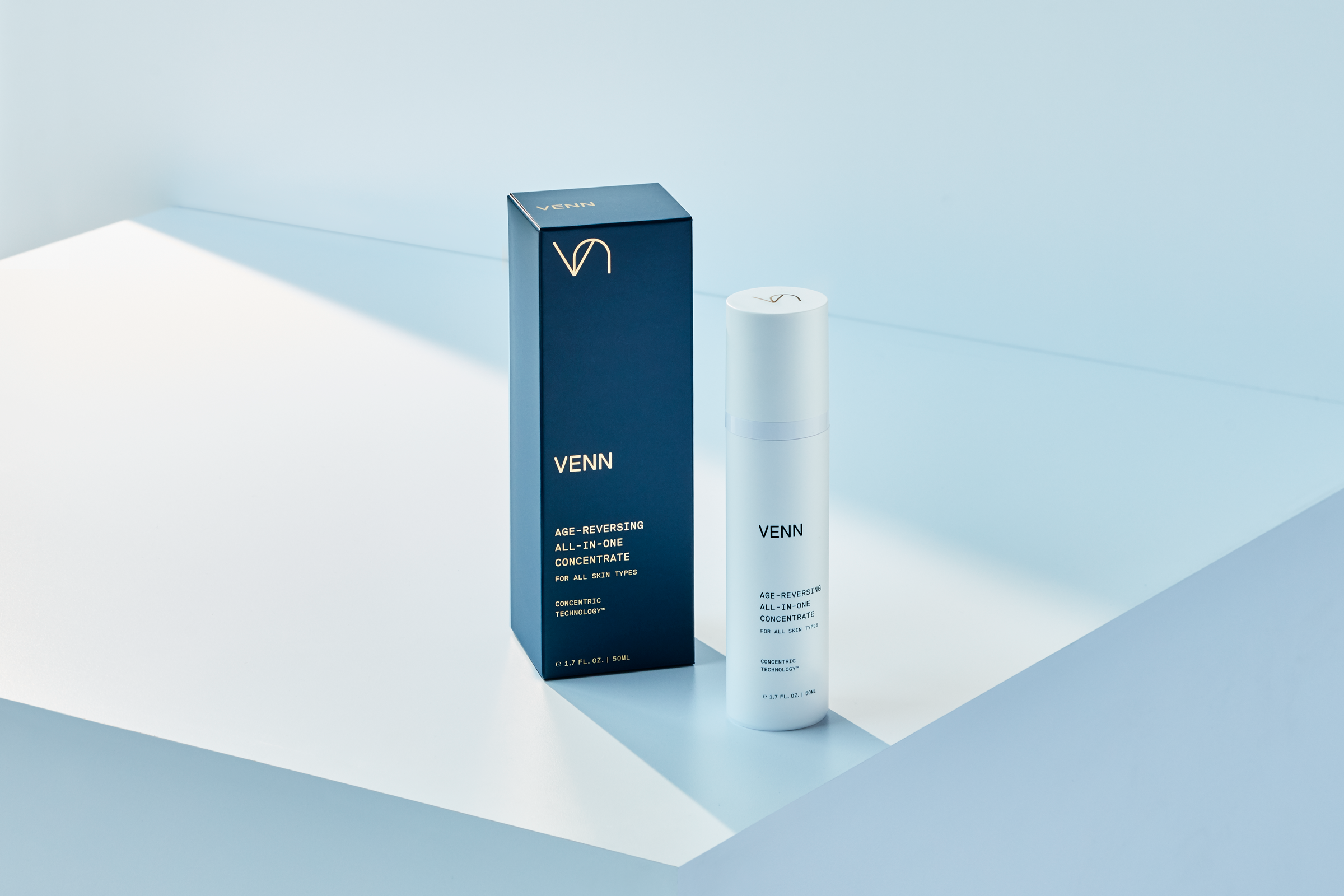
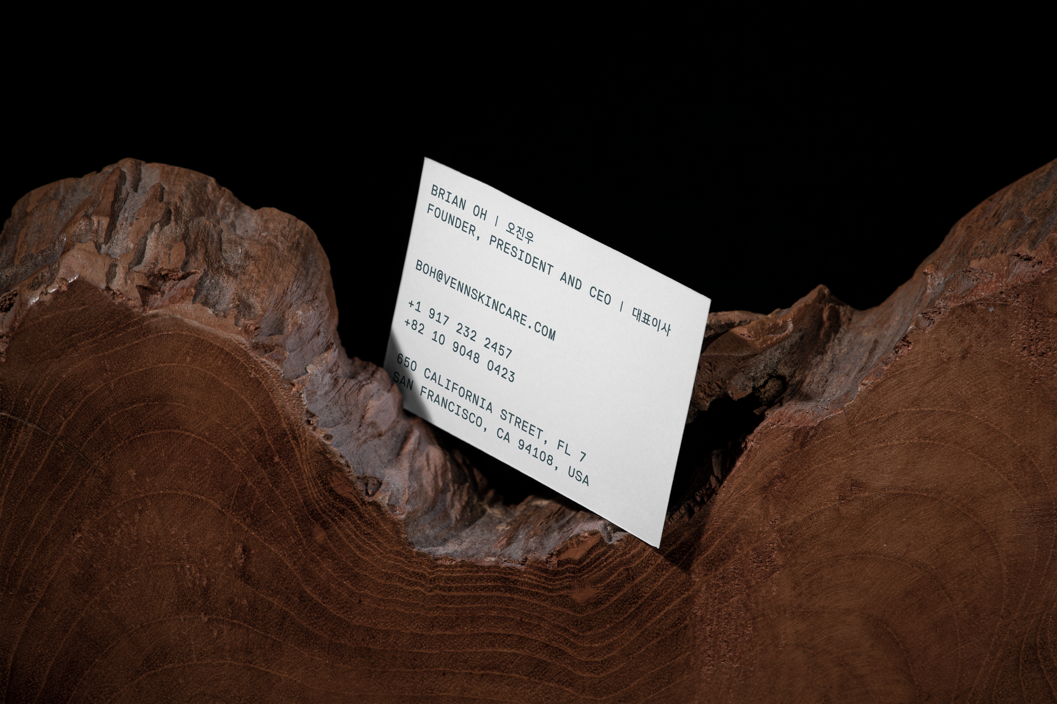
Brand identity, packaging, and website for a company reshaping the daily skincare routine. Most regimens take too much time. Venn set out to change that. While at Pentagram, I helped define the strategy, name the company, and build a brand that feels scientific and calm. The identity carries a sense of precision without losing warmth.
The design stays clean. The forms are simple. Color and type work together. The system reflects the product itself. Efficient. Streamlined. Focused on what matters. The story stays direct. Clinical trials proved the formula. The market responded fast. Everything sold out leading into the Fall 2017 launch.
Client: Venn; Studio: Pentagram; Partner-in-charge: Natasha Jen; Art Director: Joseph Han; Design: Derek Love, Ran Zen; Strategy, Naming: Ilan Beesen; Typeface: Replica Mono; Year: 2017.
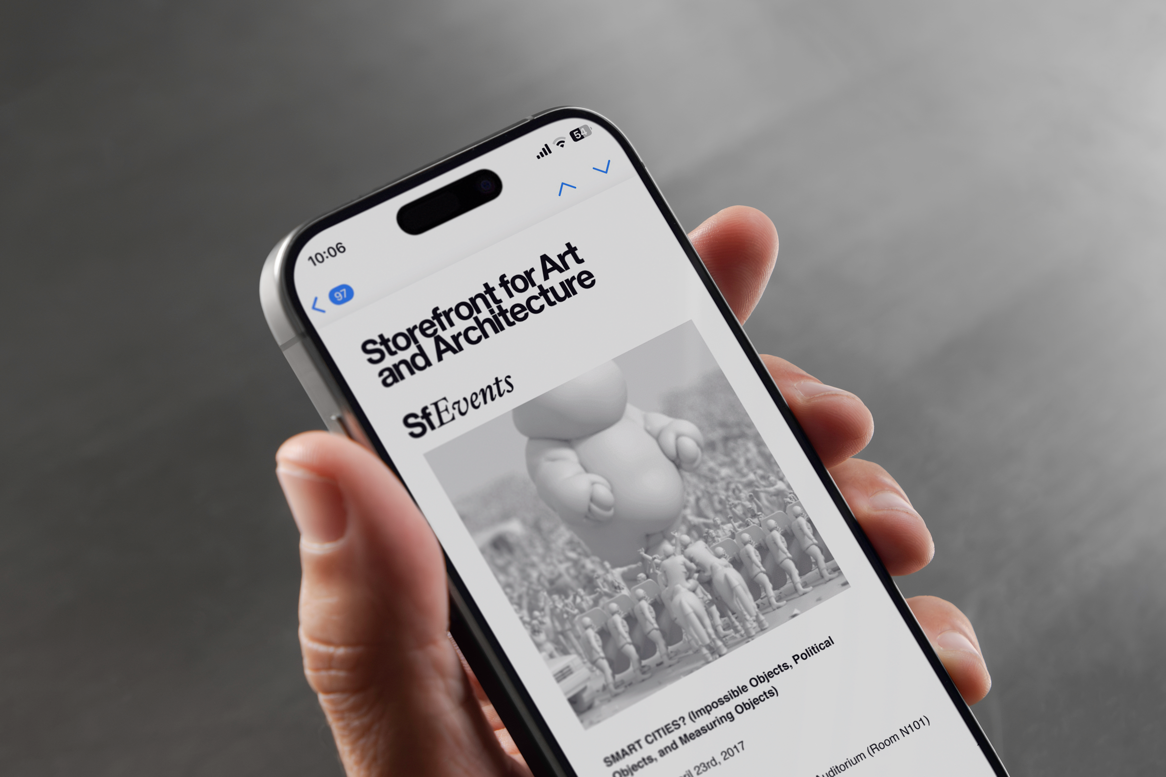
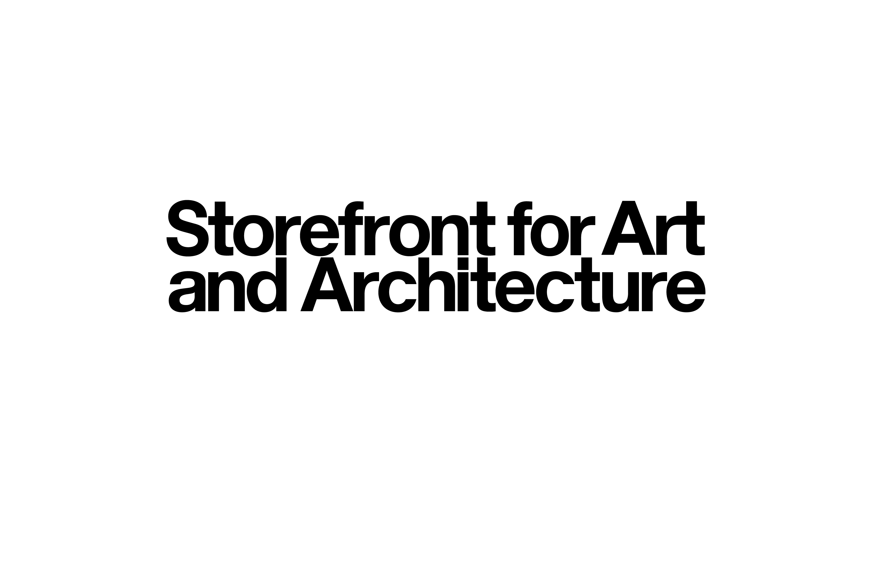
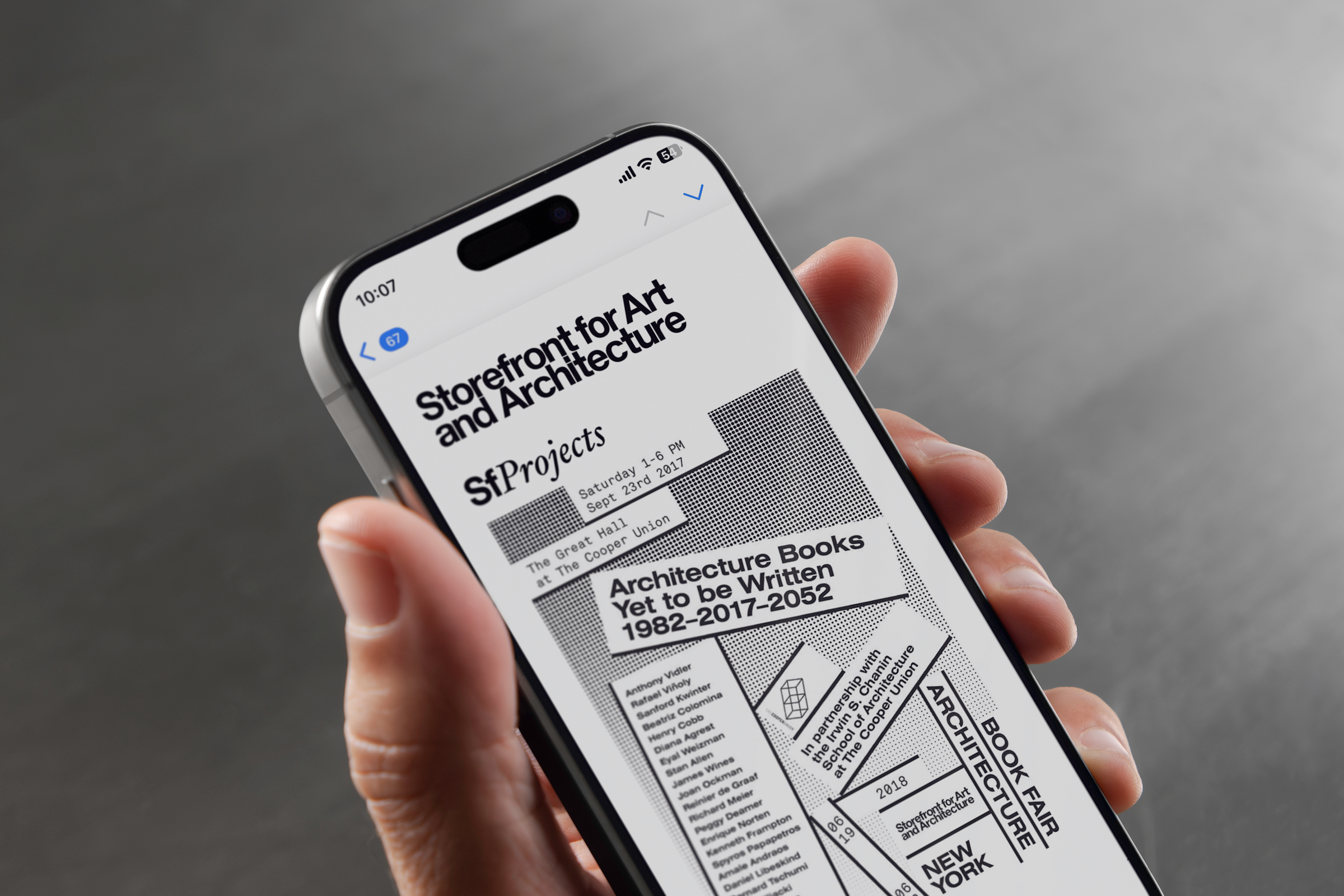
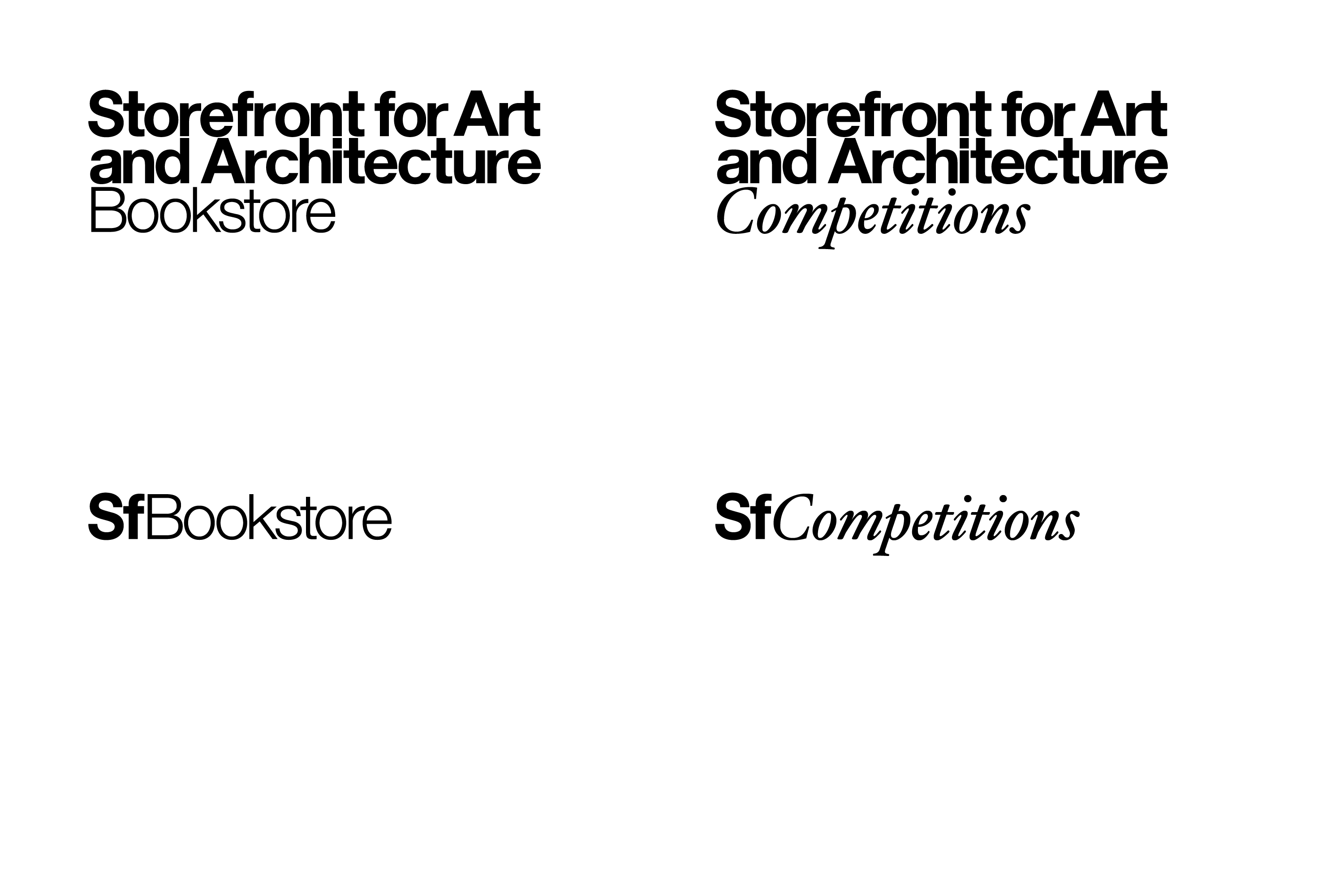
Nomenclature design for a platform that supports architectural discourse. Storefront has produced events, publications, and initiatives since 1982. The range is wide, which created visual noise. While at Pentagram, I worked with the team to bring order to the system. We defined two clear channels. Commodities like the bookstore received a sans serif voice. Temporal initiatives like exhibitions received a serif voice. Simple. Direct. The structure gives each activity its own identity without losing the connection to the whole.
The result is a calm and practical naming system. It now appears across Storefront communications and helps people understand what they are looking at with less effort.
Client: Storefront for Art and Architecture; Studio: Pentagram; Partner-in-charge: Natasha Jen; Designer, Copywriter: Derek Love; Typefaces: Helvetica, Hoefler Text; Year: 2017.
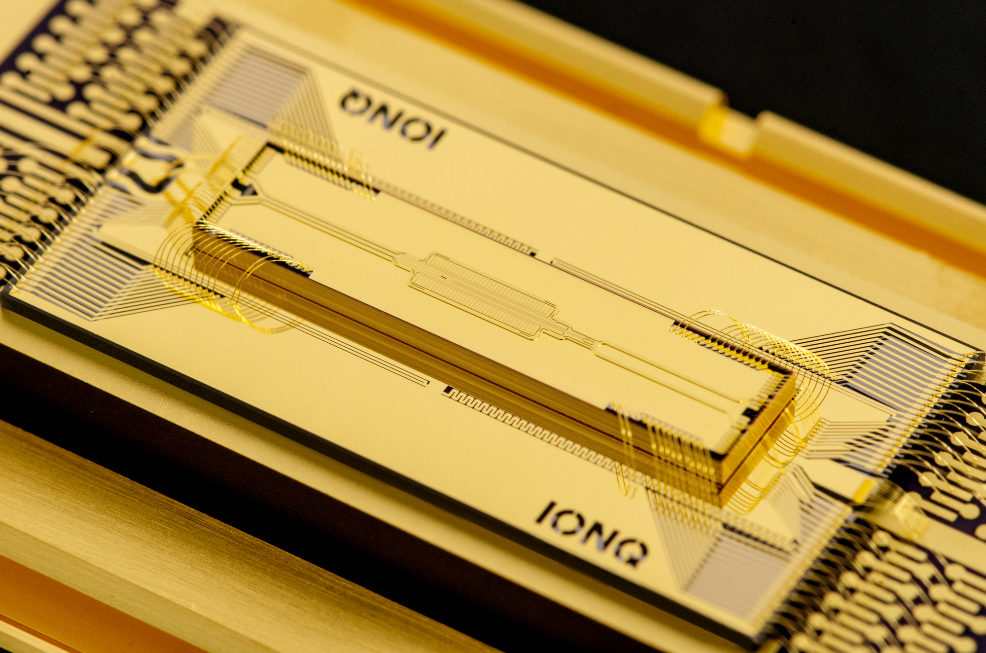
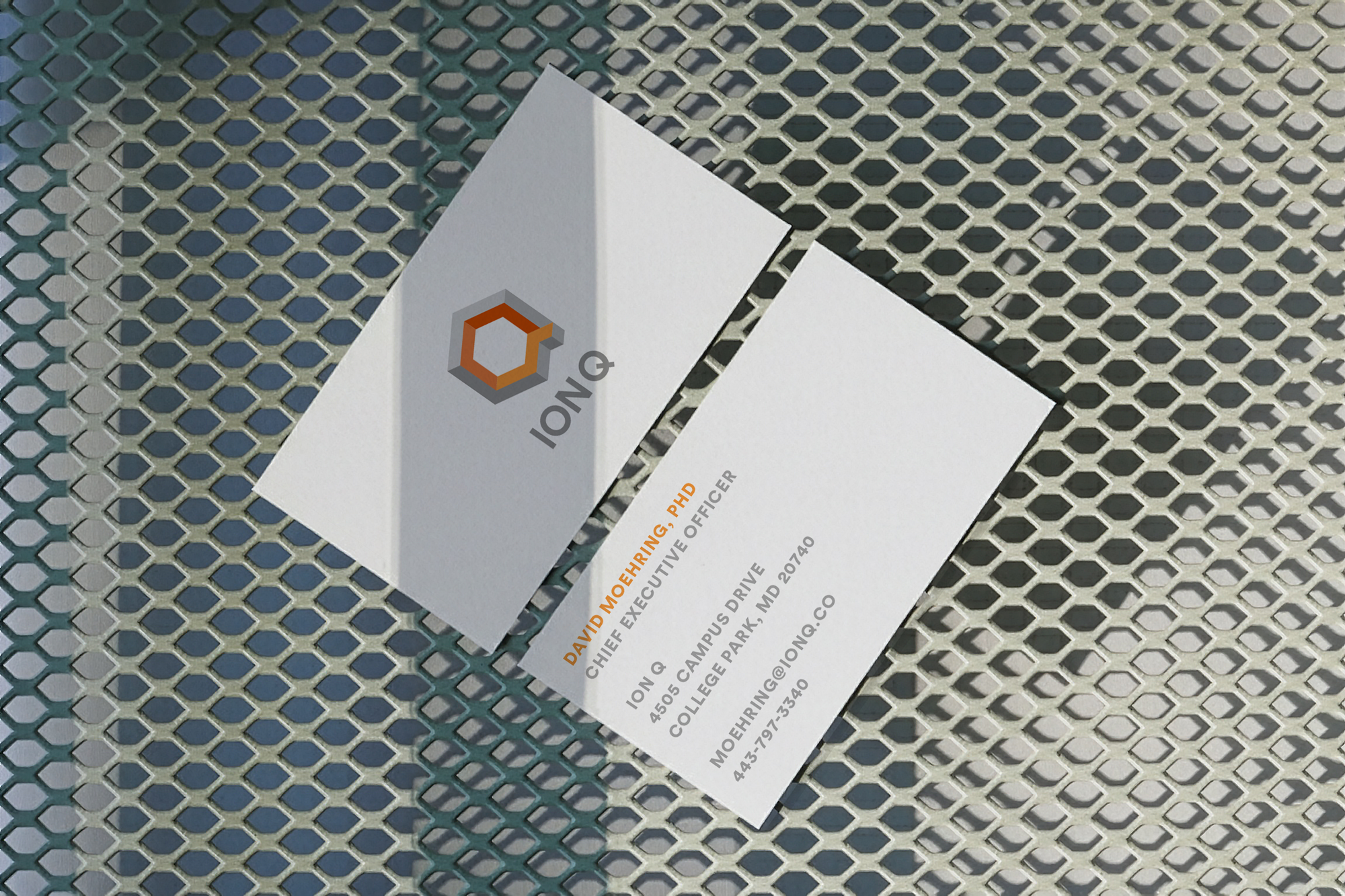
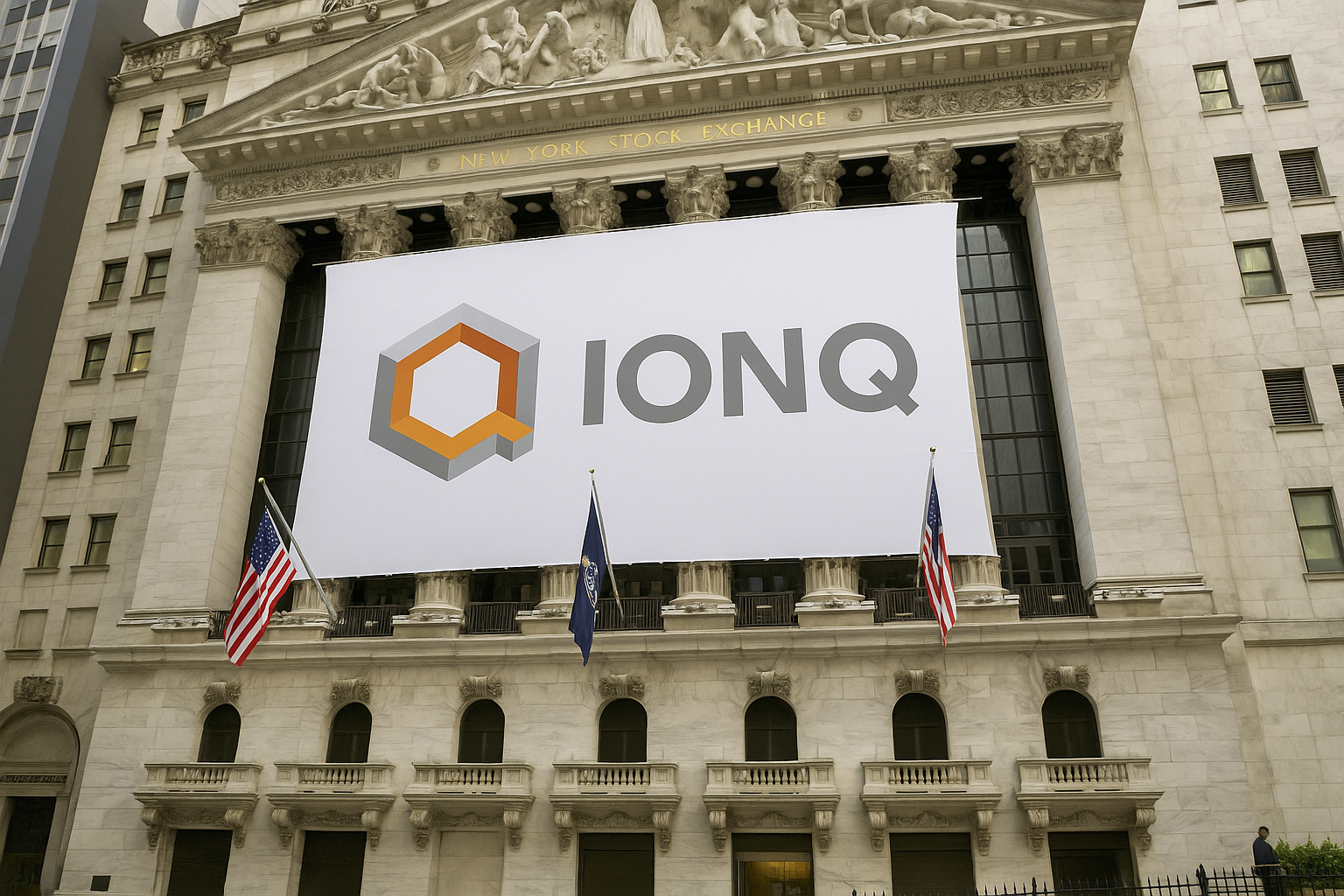
Visual identity and website for a quantum computing start up. Classical computing has pushed far, but its growth is slowing. IonQ works in a different space. Their trapped ion approach allows calculations that move beyond the limits of binary systems. The technology is complex. The goal of the identity was not. While at Pentagram, I helped create a clear and steady visual language that reflects their method and sets them apart from larger competitors like Google, IBM, and Microsoft.
The system stays simple. It focuses on structure and clarity. The forms echo the precision of the trapped ion process without turning into illustration. The typography remains clean. The tone is measured. The identity gives IonQ a distinct presence in a field defined by abstraction.
Client: IonQ; Studio: Pentagram; Partner-in-charge: Natasha Jen; Designers: Derek Love, Ji Park, Ran Zen; Image courtesy of IonQ; Typeface: Circular; Year: 2017.
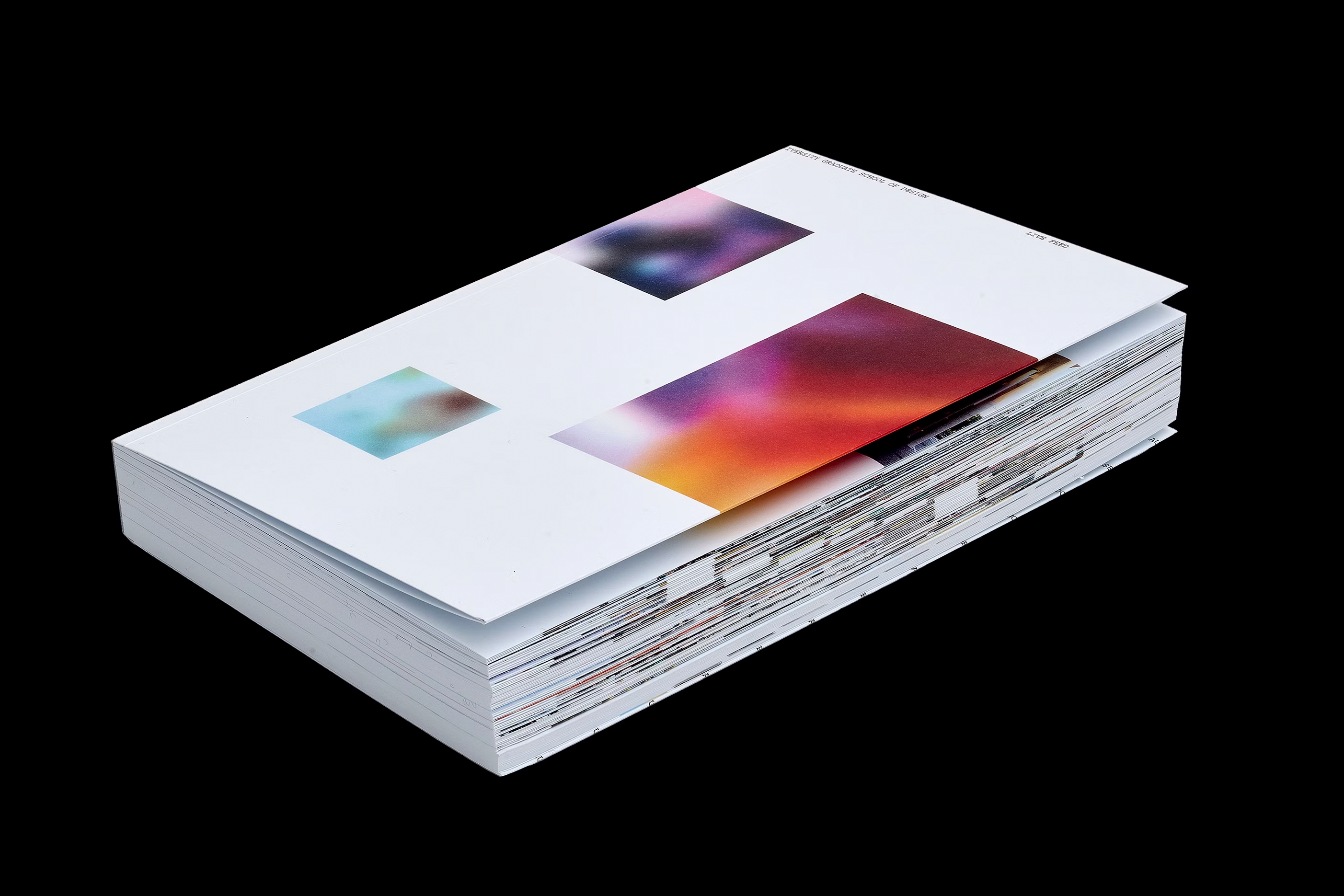
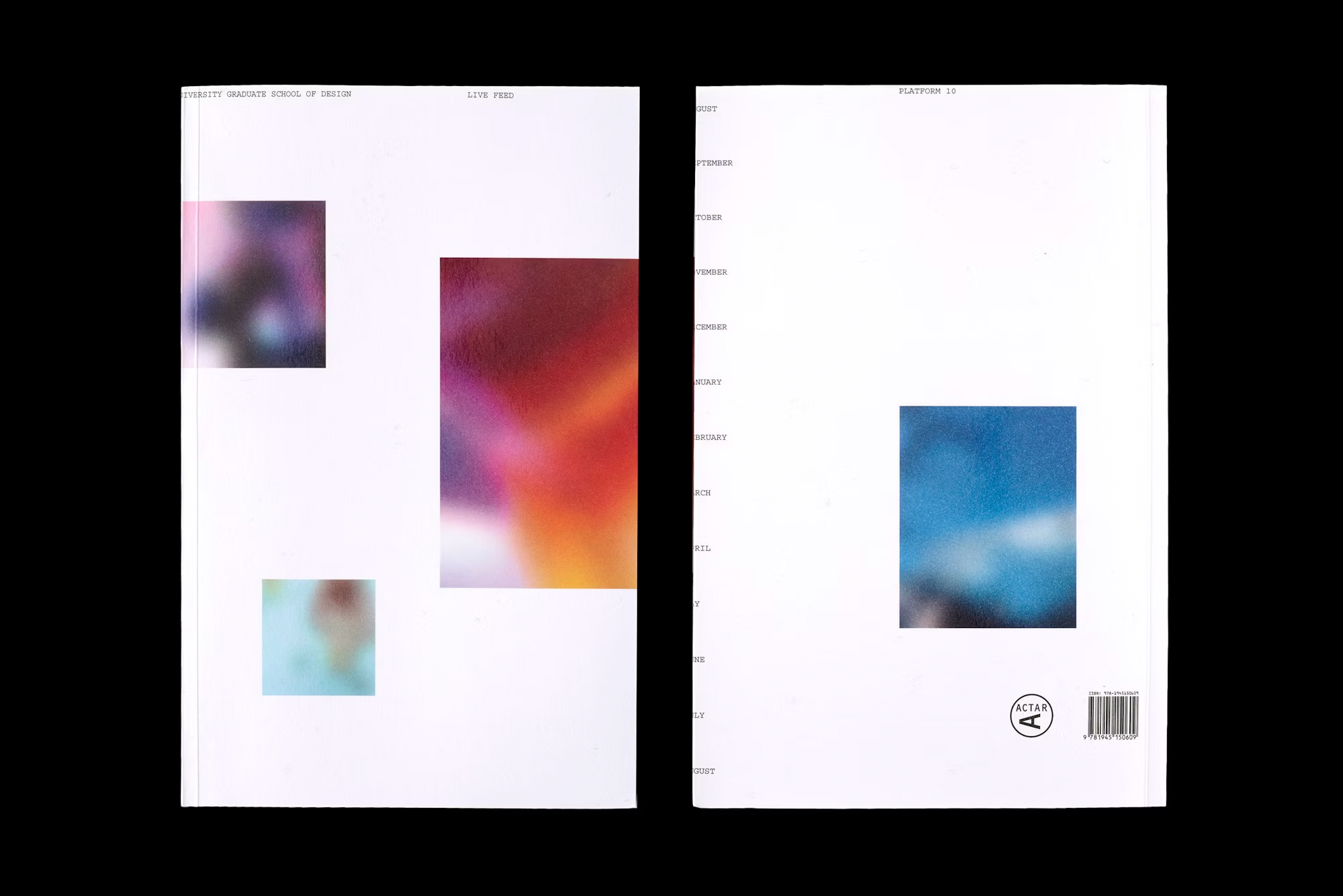
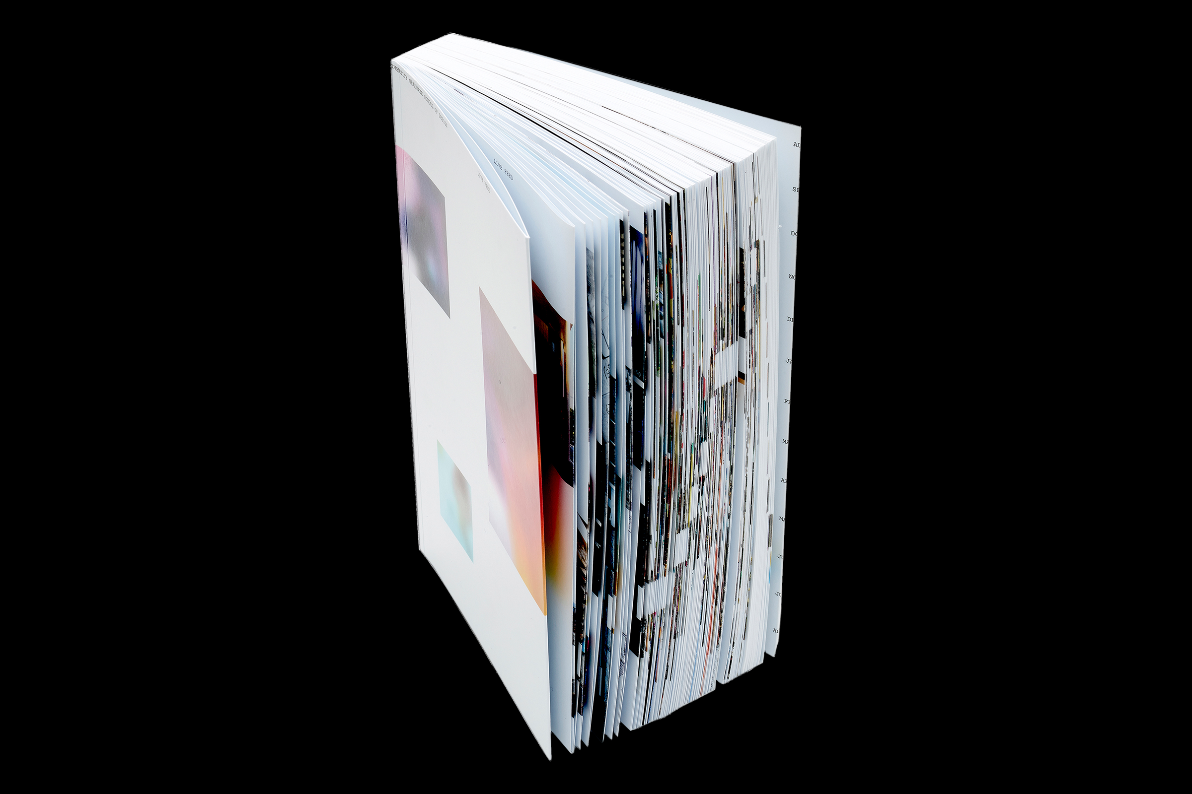
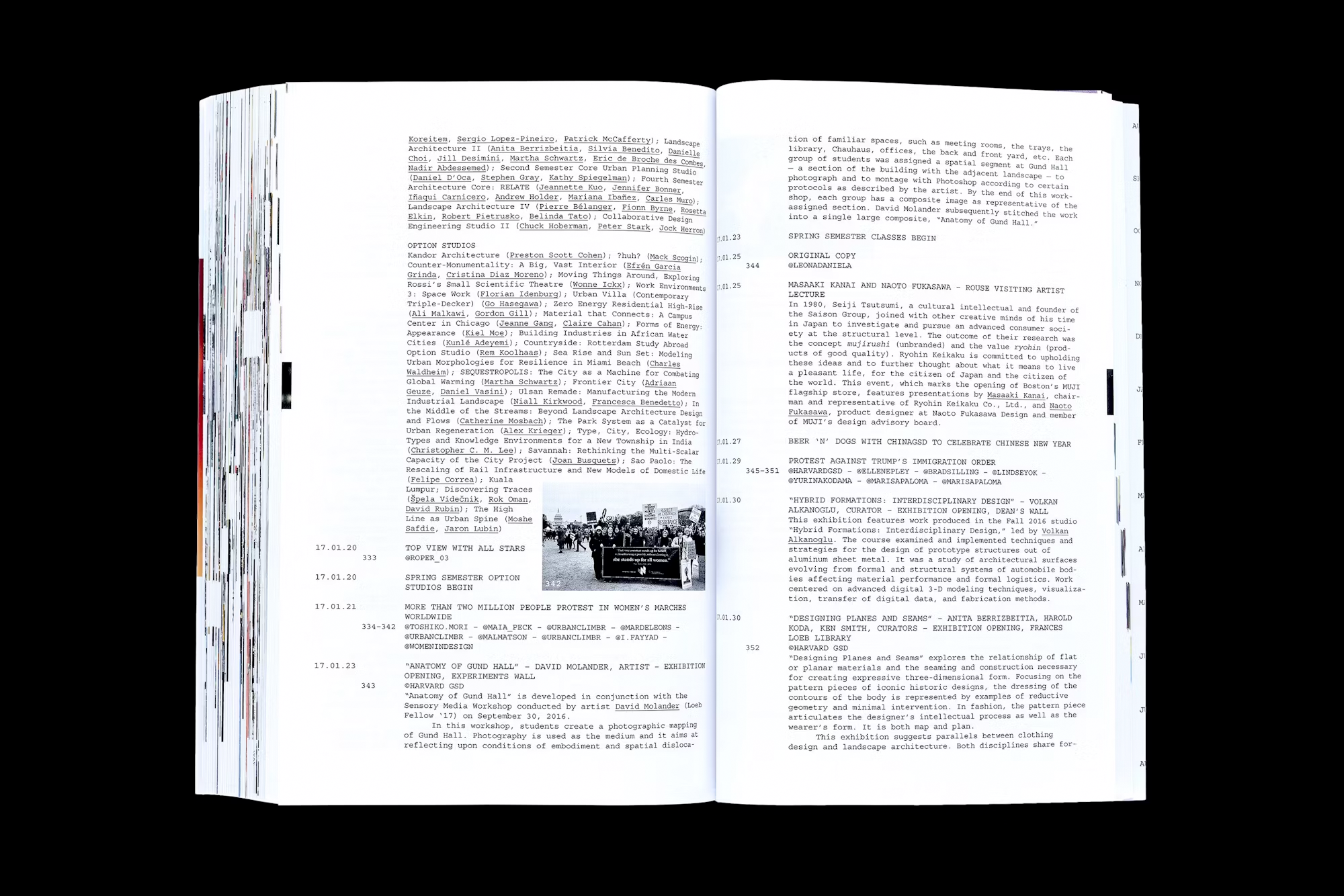
Publication design for a graduate school that gives students a real platform. Each year the Harvard GSD releases Platform, a book that gathers student work, events, lectures, and exhibitions. While at Pentagram, I worked with the student editorial team to define a clear idea. We treated the book like a live feed. The story moves in reverse. It starts at the end of the academic year and travels back to the beginning. The approach feels immediate and unfiltered.
The form follows that logic. Images break standard boundaries. Page numbers fall away. The sequence becomes the structure. The book feels active and in motion. The design keeps the focus on the work and reflects the pace of the school.
Client: Harvard Graduate School of Design; Studio: Pentagram; Partner-in-charge: Natasha Jen; Art director: Joseph Han; Designer, Researcher: Derek Love; Design: Ji Park; Typeface: Courier; Year: 2017.
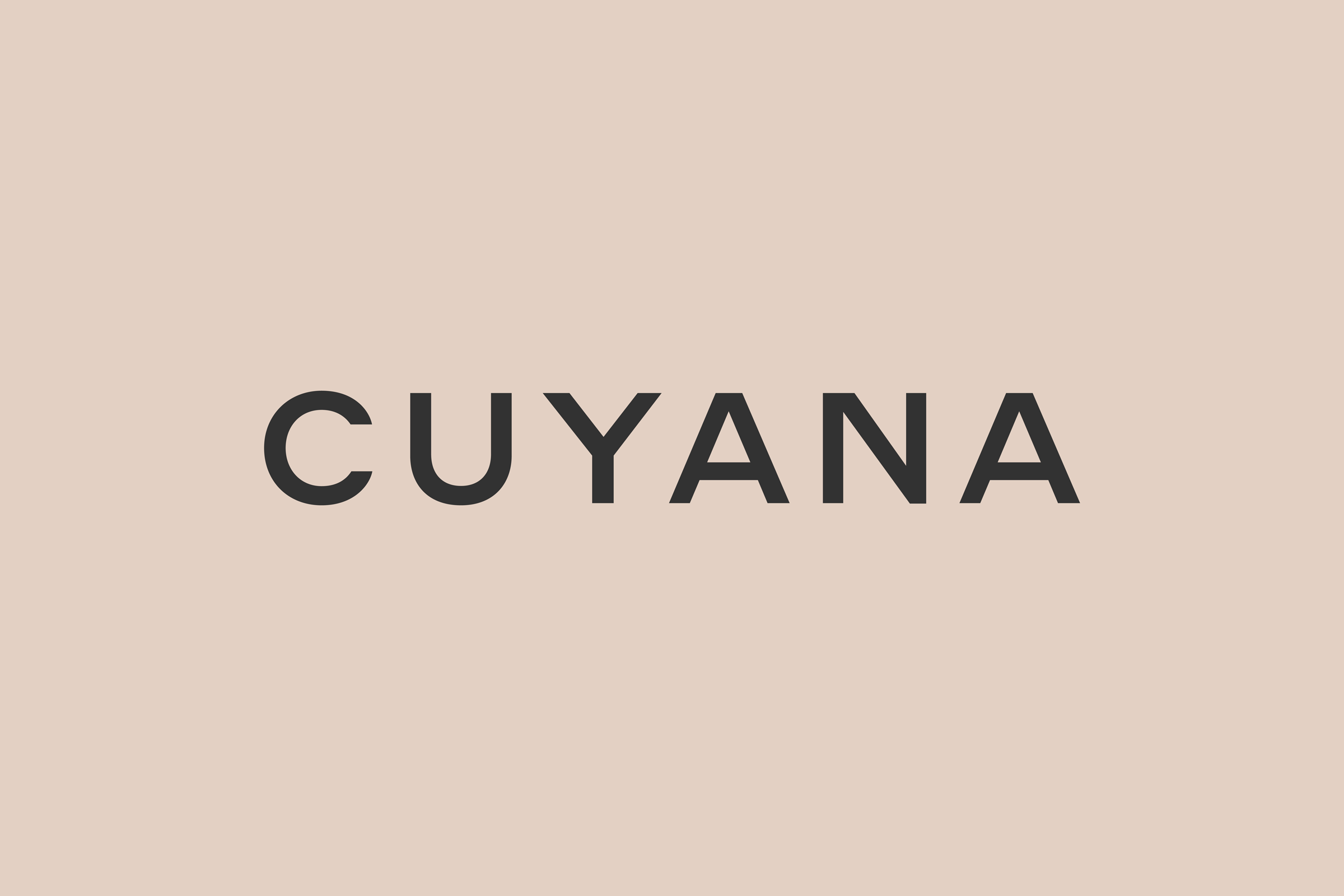
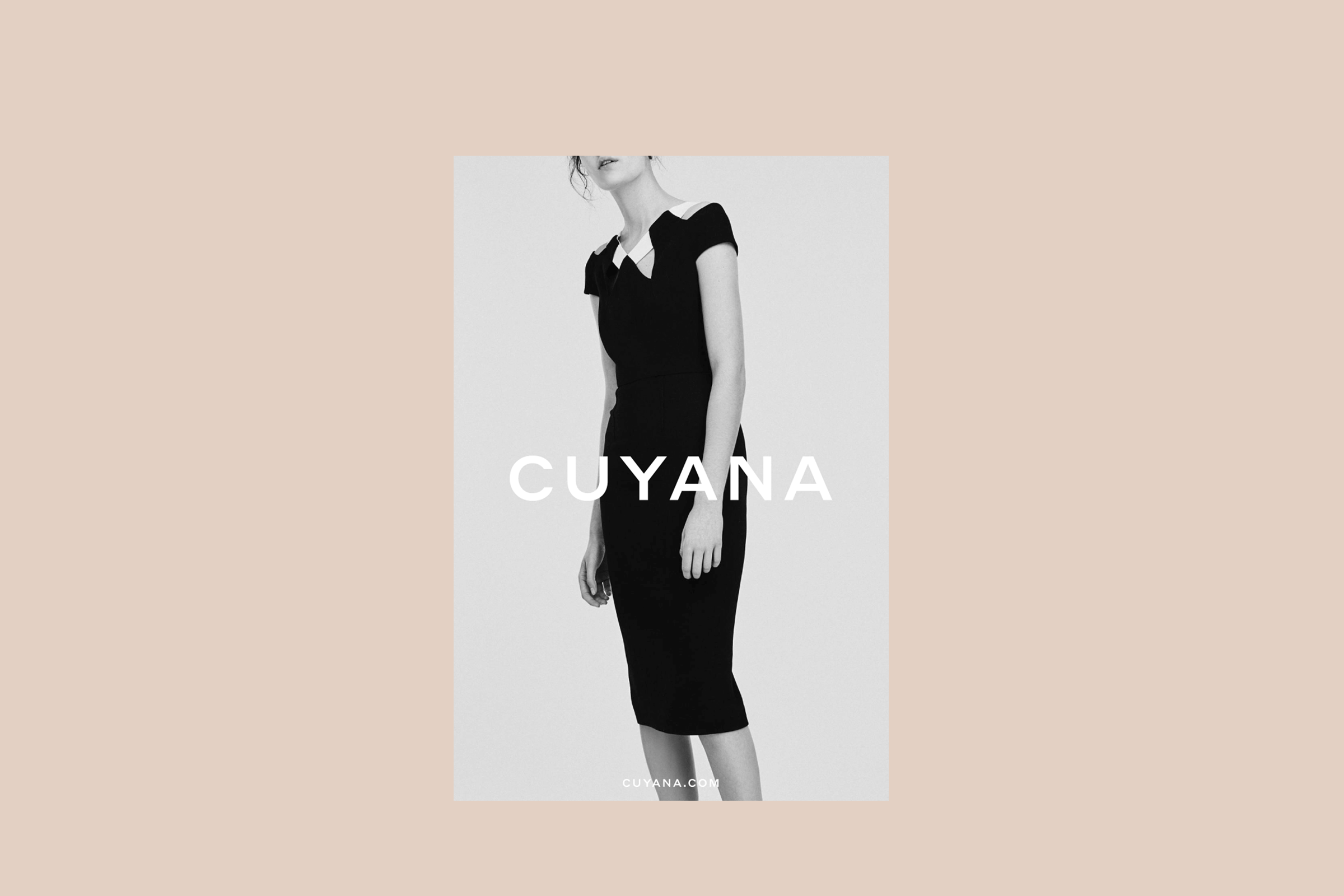
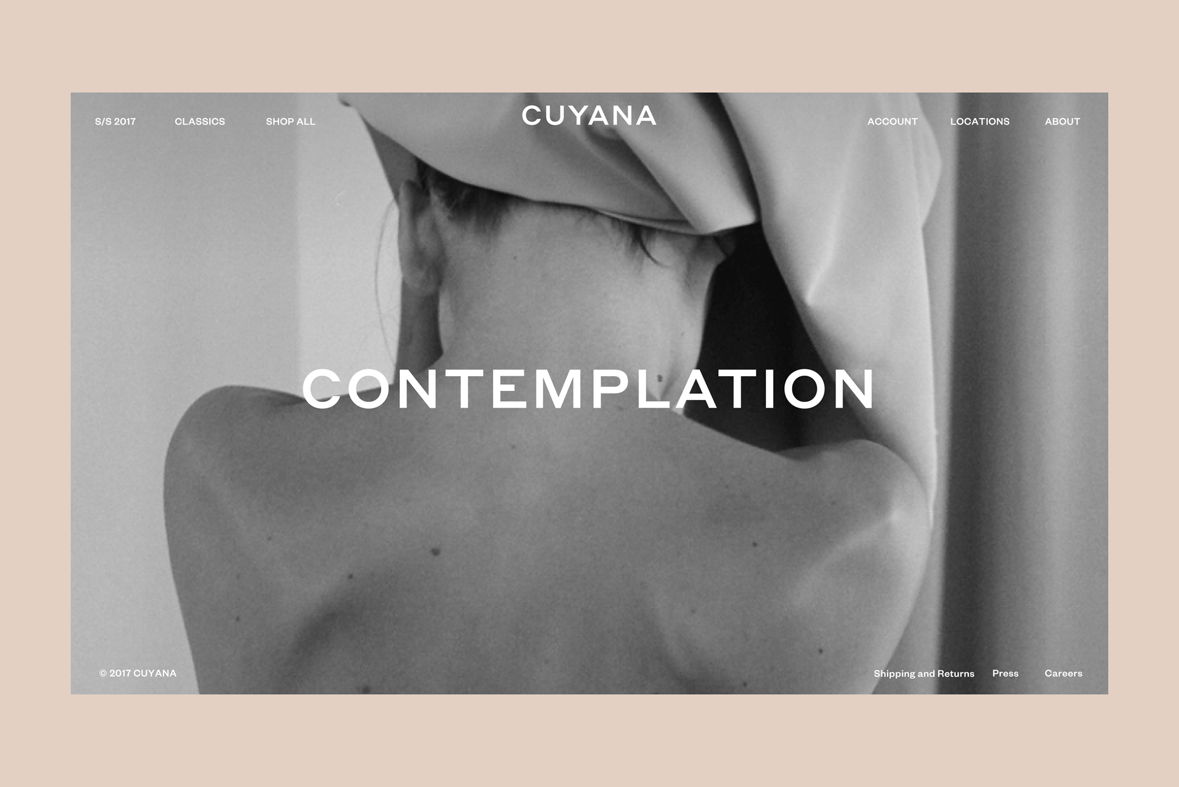
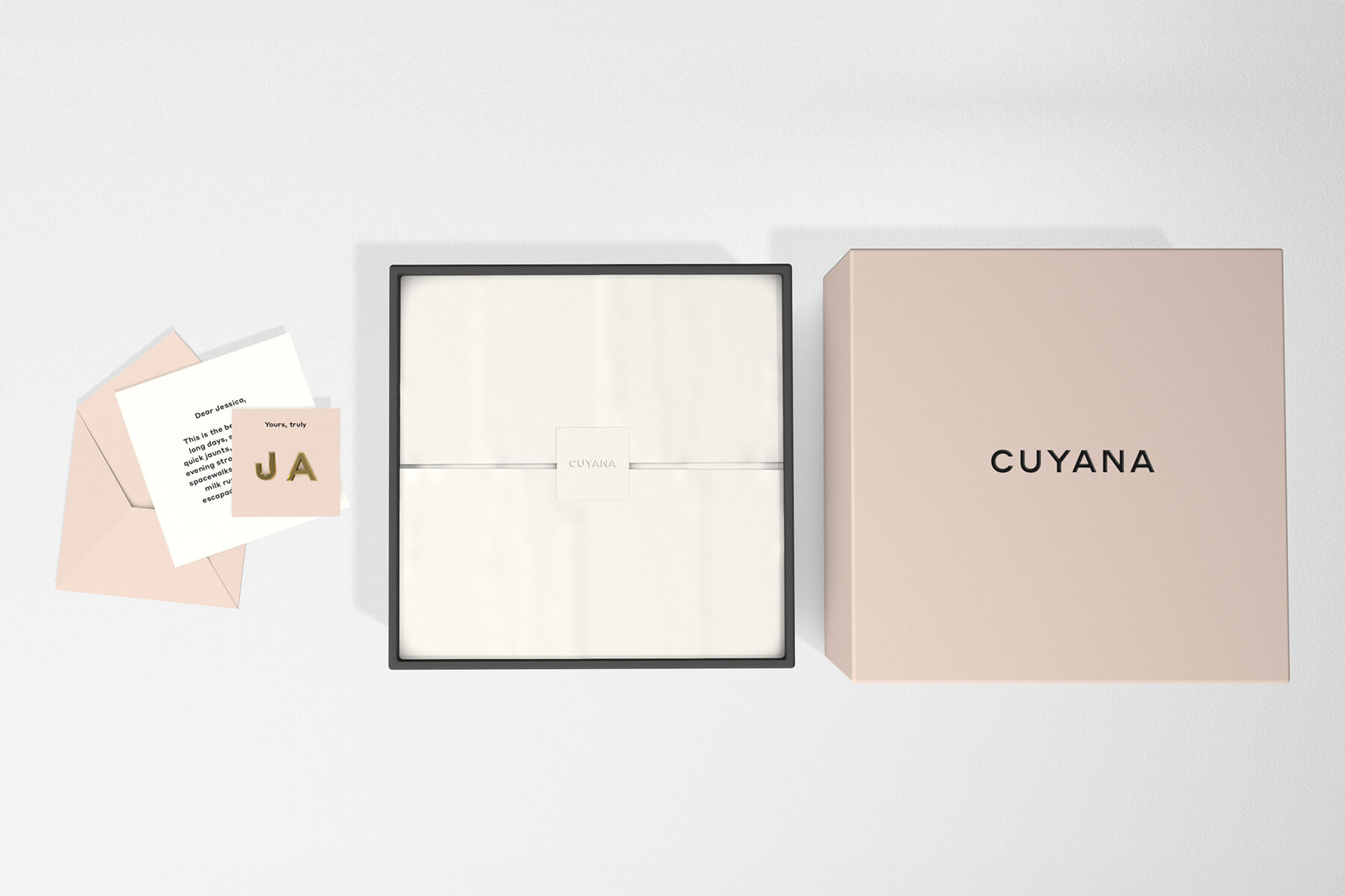
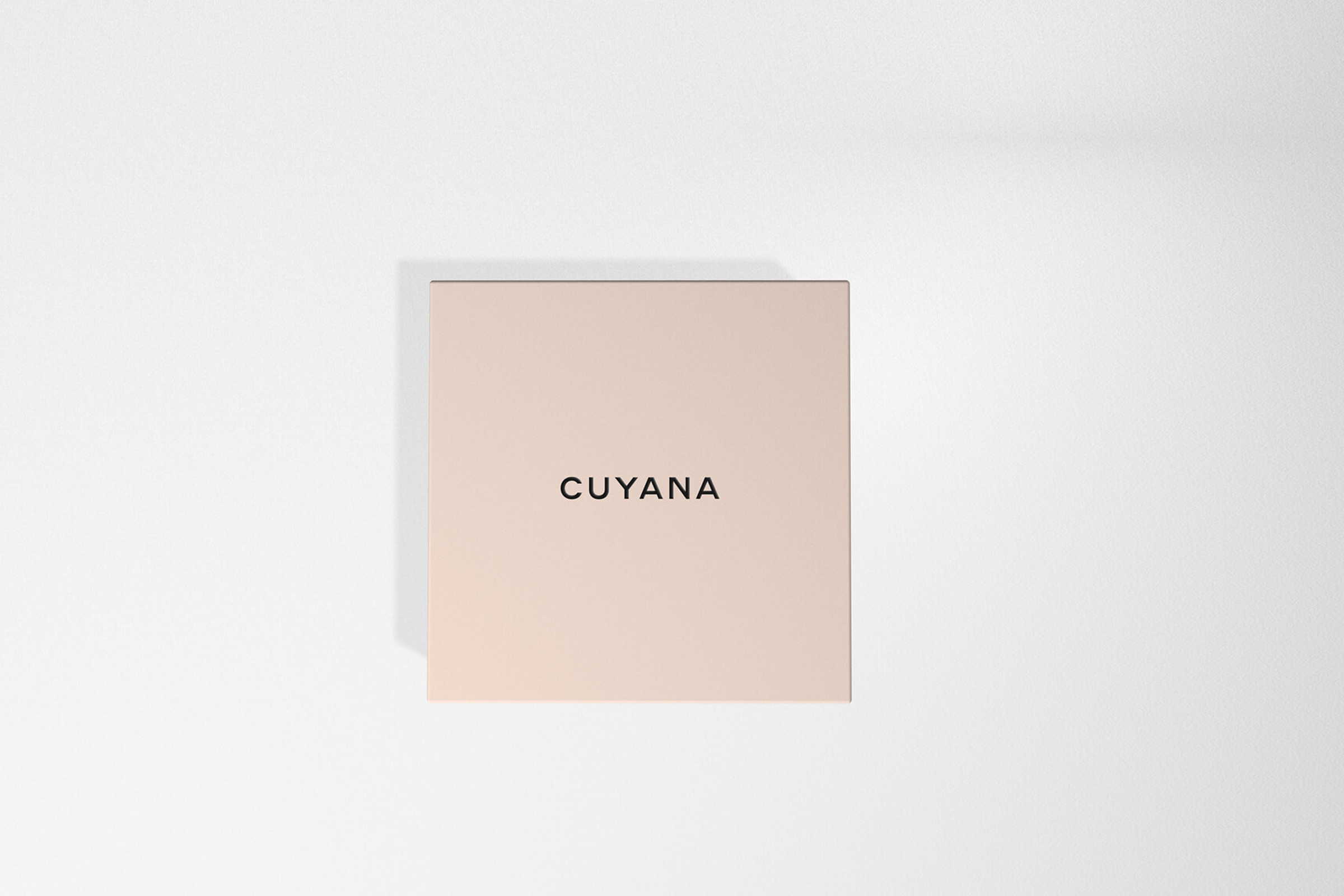
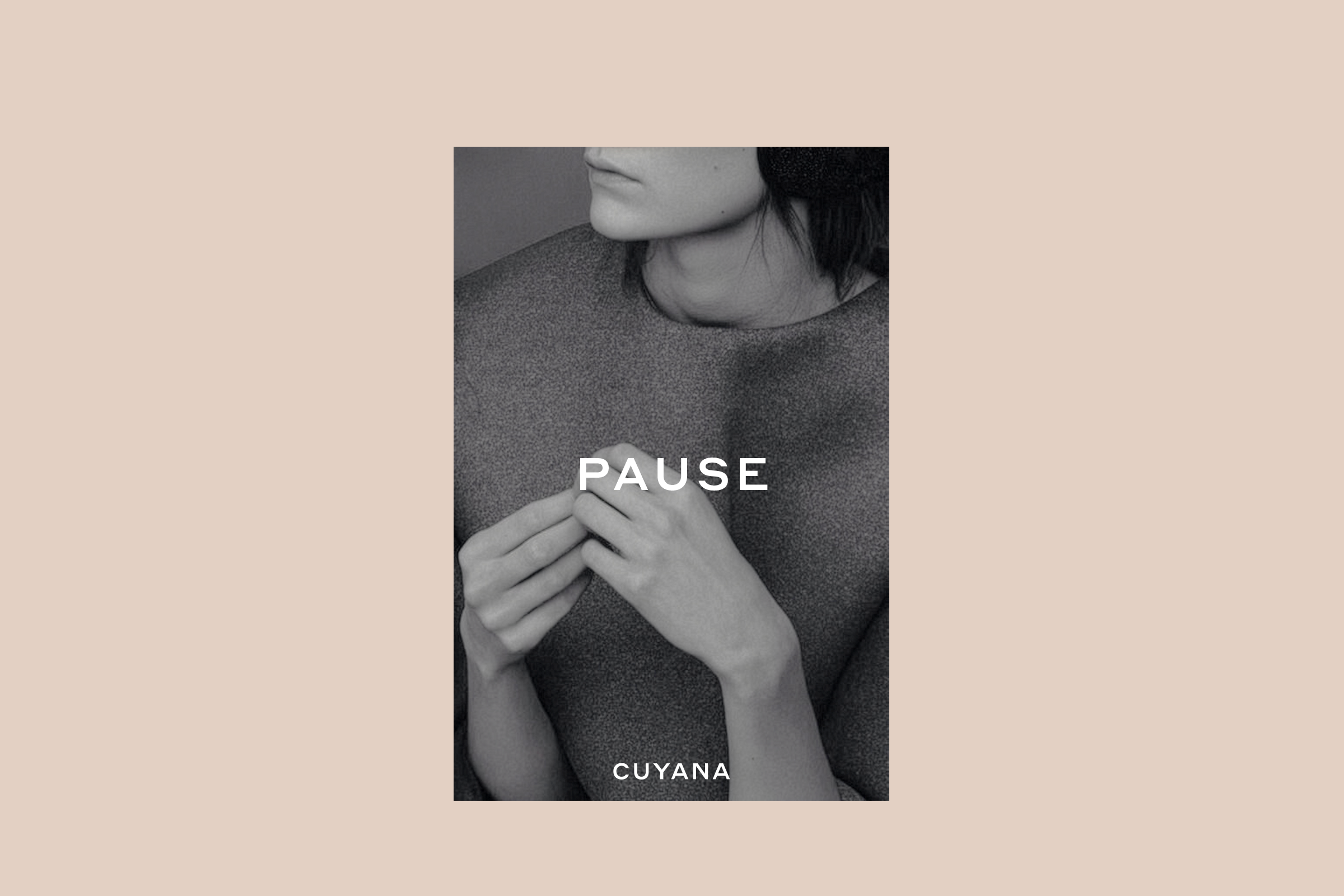
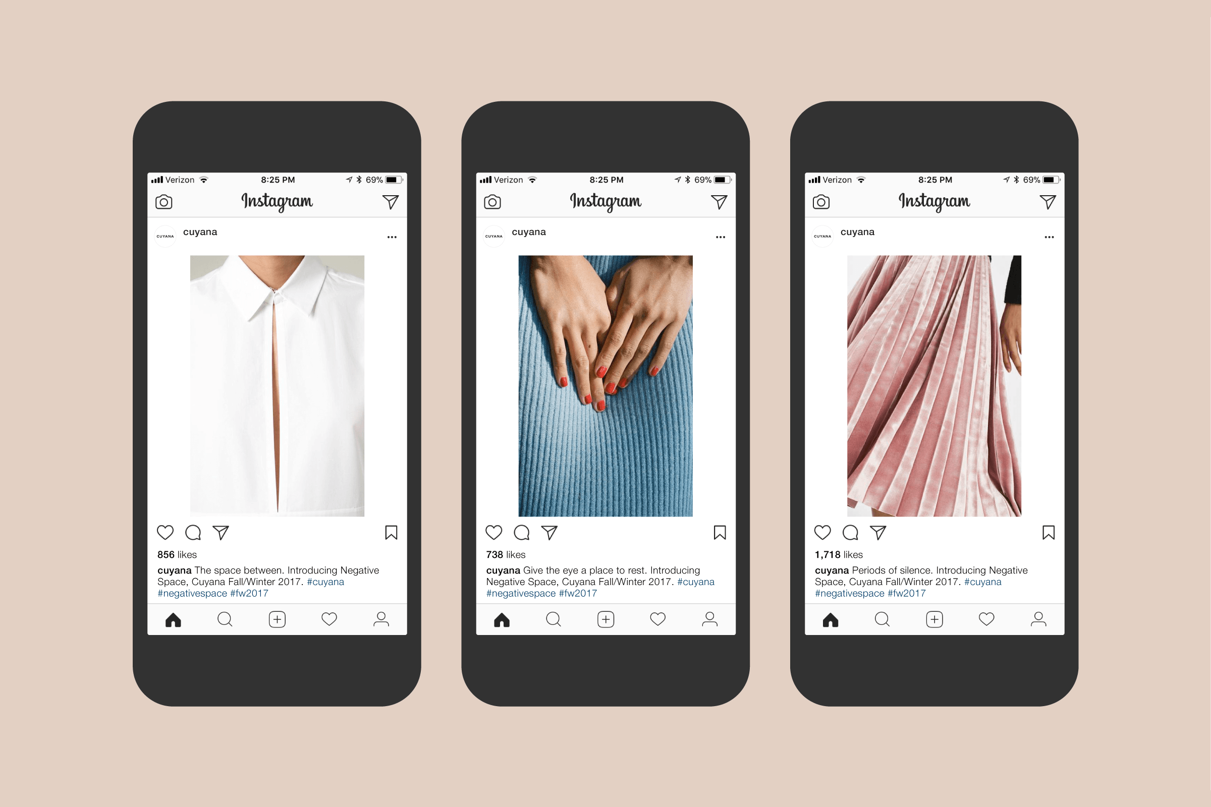
Brand identity and packaging for a fashion label pushing against a culture of waste. The industry produces massive amounts of discarded clothing each year. Cuyana offers a quieter path with a simple idea. Fewer, better things. While at Pentagram, I studied their materials and their competitors and shaped a visual and verbal language that supports this belief. The tone stays warm and measured. The message stays firm.
The identity is restrained. The palette is calm. The typography is precise. Everything is reduced to what is essential. The system amplifies the brand without overpowering it. The work reflects the values behind the products. Slow. Considered. Built to last.
Client: Cuyana; Studio: Pentagram; Partner-in-charge: Natasha Jen; Art director: Joseph Han; Typography consultant: Berton Hasebe; Designer, Copywriter: Derek Love; Design: Yotam Hadar; Typeface: Styrene; Year: 2017.
Before Pentagram, Derek led Love&Partners, a design practice focused on brand strategy and identity for commercial and cultural clients. The work emphasized cohesion, refinement, and strong concepts, building brands with clarity and purpose.
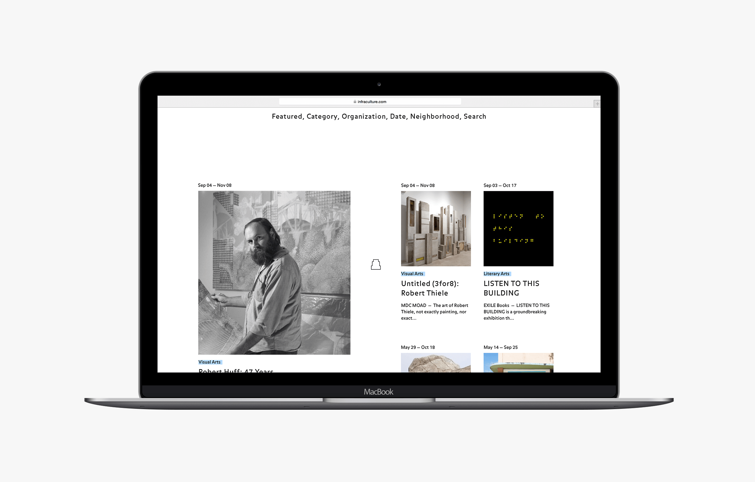
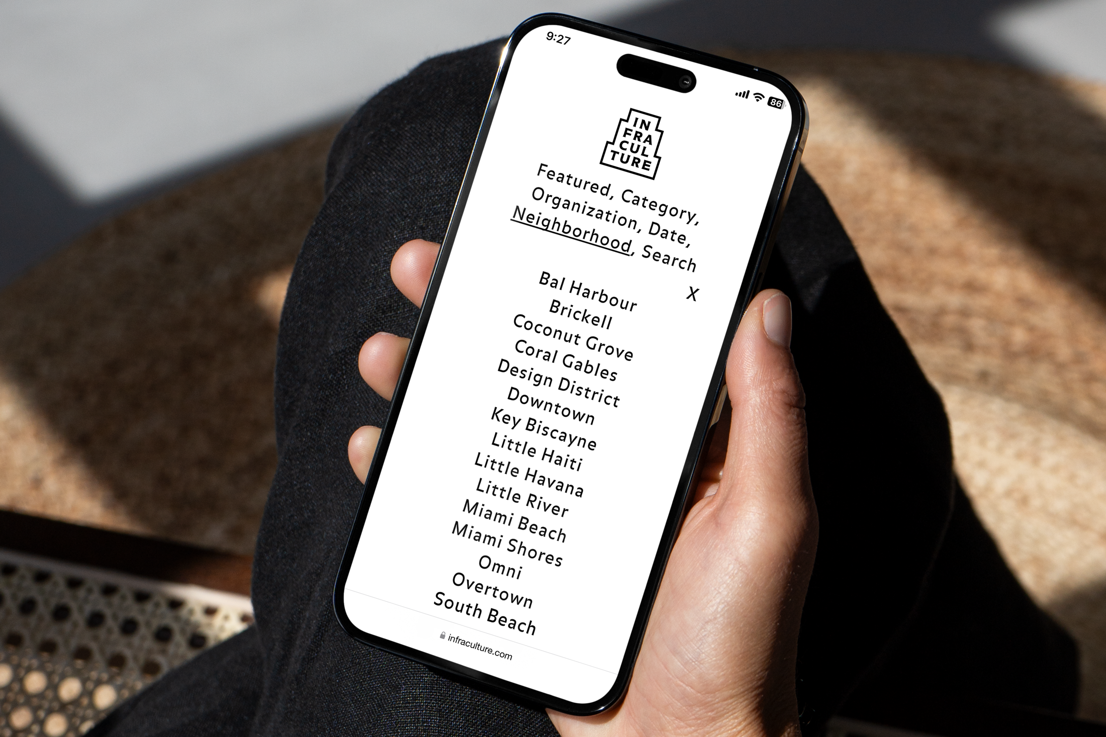
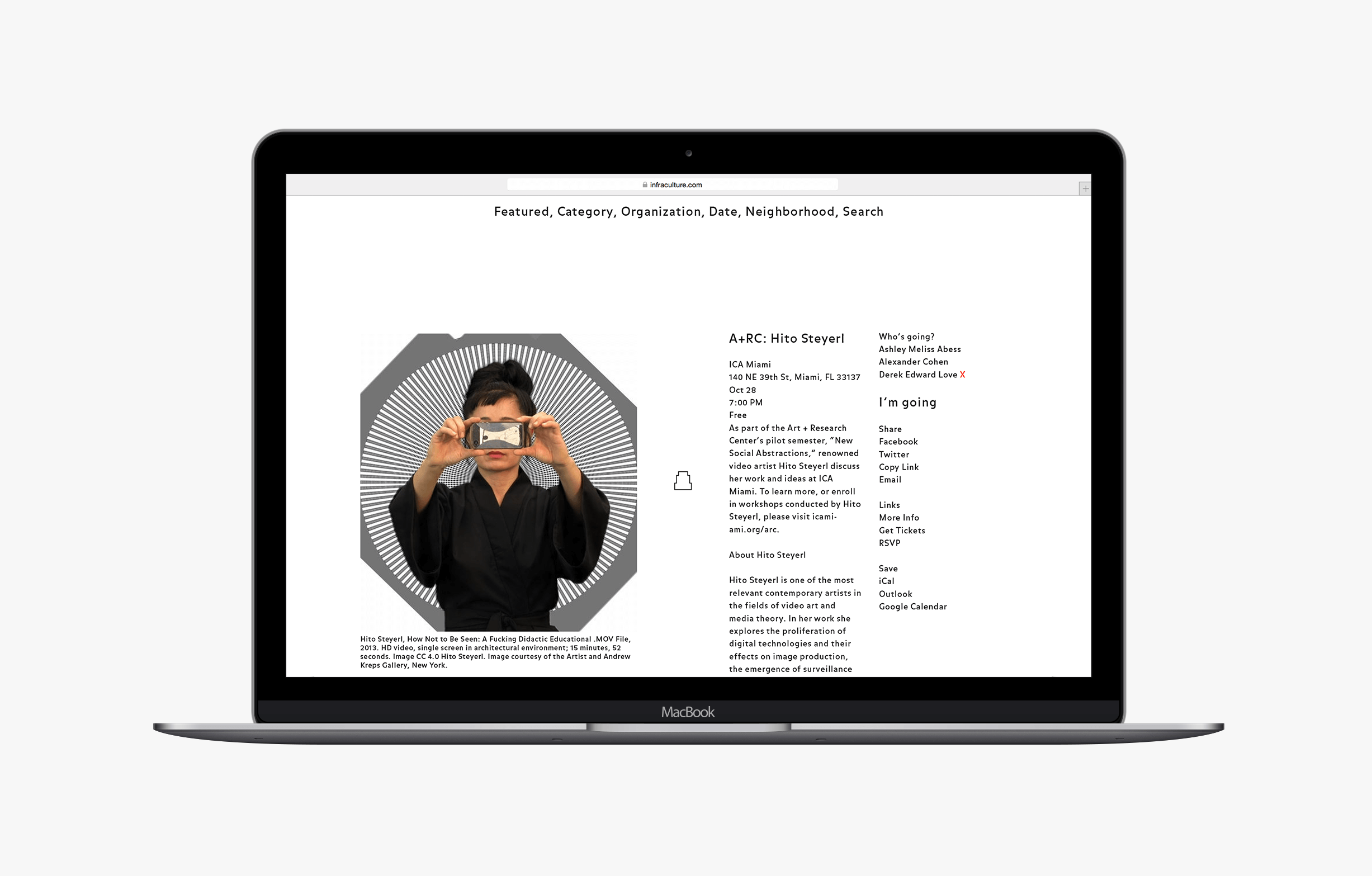
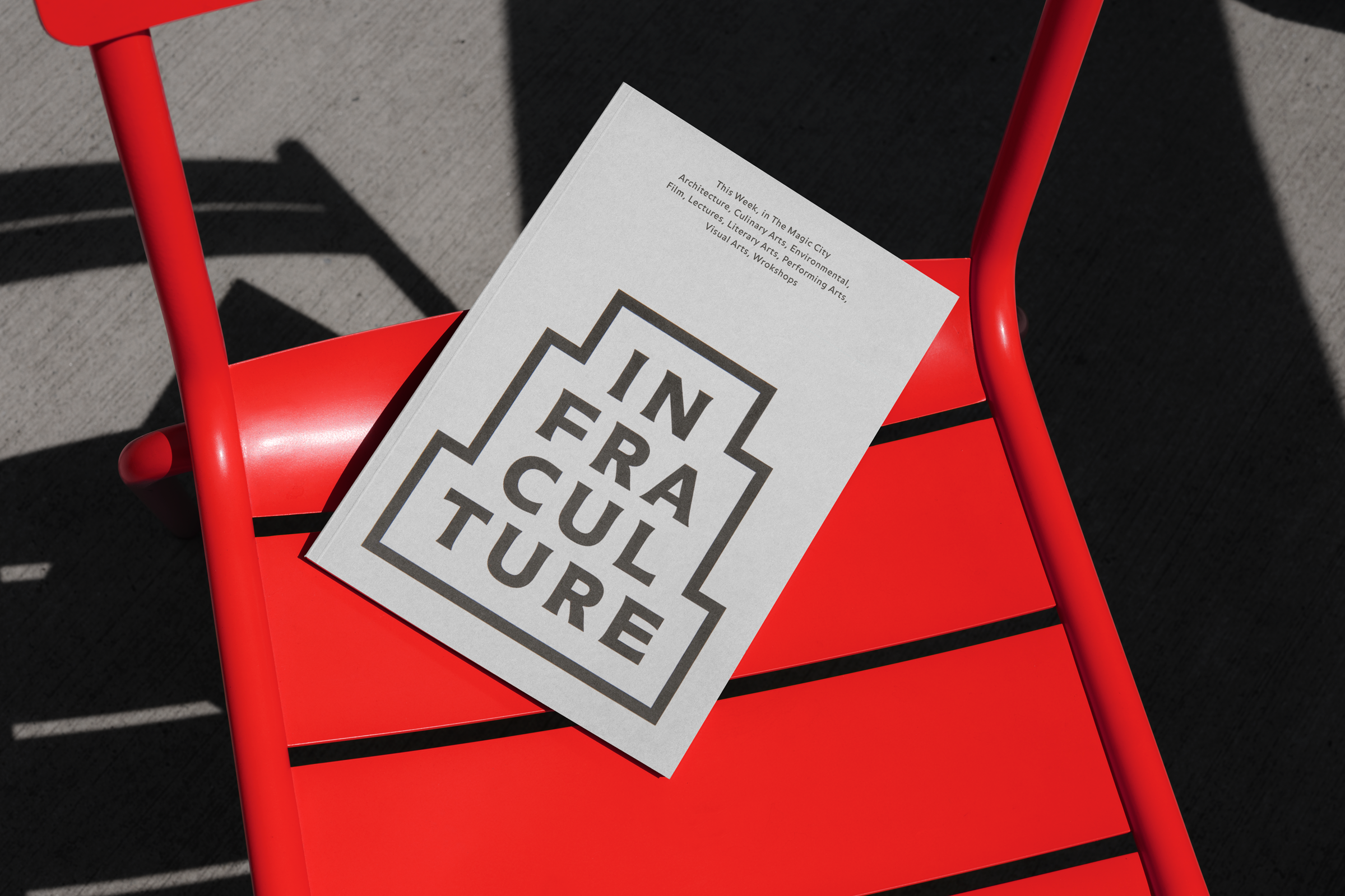
Name, brand identity, and website for a platform built to highlight Miami’s creative side. For years the city’s cultural life sat in the shadows of its party image. People struggled to find serious programming. Infraculture changed that. It launched in 2013 and brought the city’s leading cultural institutions onto one site. The goal was simple. Make the work visible. Make it easy to find.
The platform grew fast. In 2014, Miami Magazine named it the best site for culture. It carried programming across architecture, culinary arts, environmental work, film, lectures, literary arts, performing arts, visual arts, and workshops. After four years of service, the landscape shifted. Cultural access became broader and more public. With that growth, Infraculture completed its role and was deactivated in 2017.
Client: Infraculture; Studio: Love&Partners; Creative Director, Designer, Namer: Derek Love; Partners: Ashley Melisse Abess, Alexander Cohen; Web Developer: Daria Riabchenko; Typefaces: Audree, Balance; Years: 2013 to 2017.
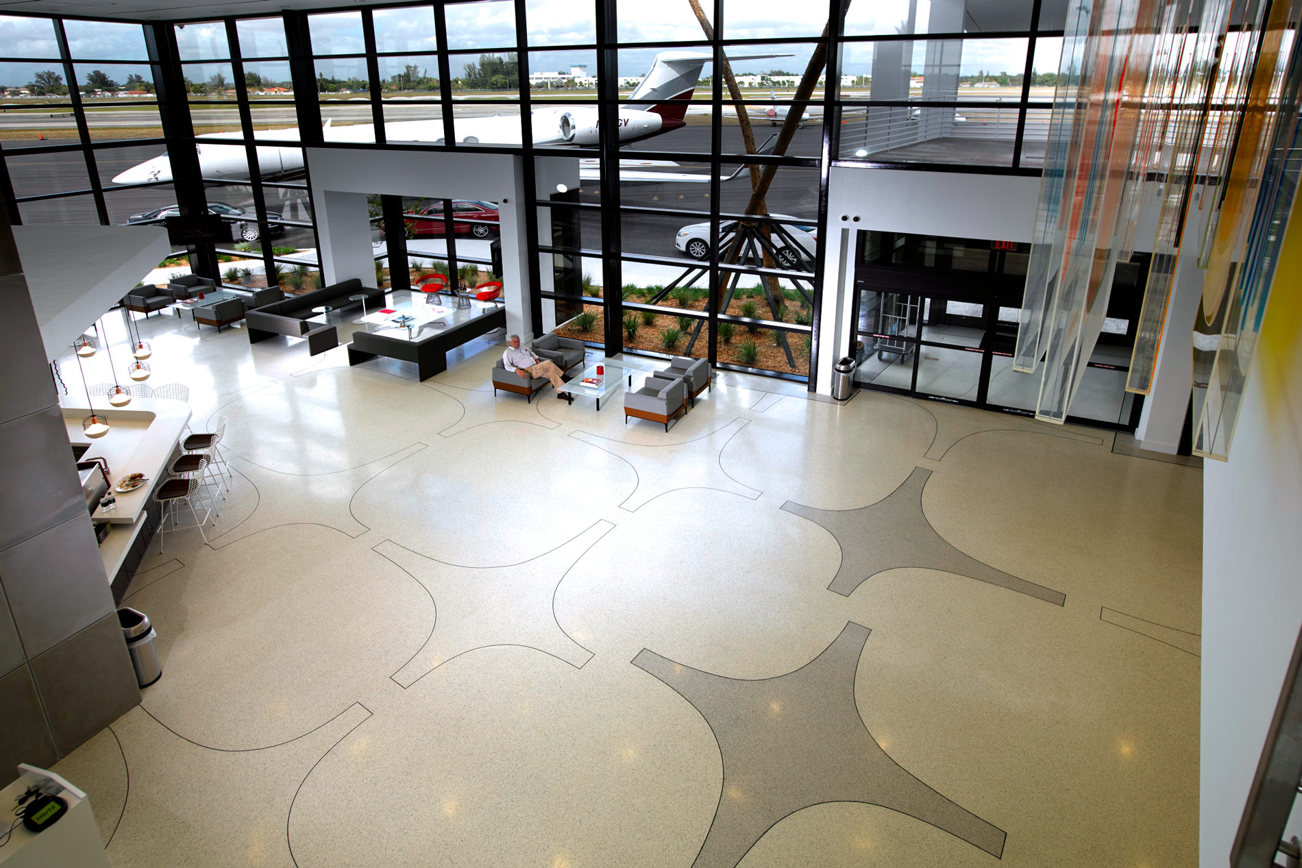
Brand identity, website, and signage for a private airport. Orion Jet Center’s aging terminal and dated visual identity were limiting its presence. At Love&Partners, I worked with architects, interior designers, and contractors to rebuild the experience from the ground up. The goal was to create a space and a system that felt clear, confident, and modern.
The identity stays simple and direct. The environment follows the same logic. Clean forms. Quiet typography. A layout that helps people move through the terminal with ease. After the redesign, Orion rose to the top position among fixed base operators in the Miami metro area according to Aviation International News.
Client: Orion Jet Center; Studio: Love&Partners; Creative Director, Designer: Derek Love; Typeface: Ideal Sans; Photography: Joe Fletcher; Years: 2012 to 2016.
Derek Love is a creative director and designer based in New York. His work sits at the intersection of visual and verbal design, built on research and shaped through narrative. He is drawn to clarity, reduction, and typographic discipline, and he treats design as a way to bring order, coherence, and meaning to complex environments. Derek has worked across brand identity, experience design, publication design, and environmental systems for commercial and cultural clients. His practice reflects a belief in sustainable ideas that outlast trends, and he approaches each project as a chance to uncover a clear point of view. Typography remains a constant thread in his work. He uses it to set tone, guide rhythm, and give form to ideas. He has held roles at Pentagram, Milton Glaser, Lippincott, and his former independent practice, Love & Partners. He now serves as Senior Creative Director at Verizon, where he leads a team of designers, writers, and creative specialists. Derek values the work of building and supporting creative teams. He enjoys mentoring, helping others sharpen their craft, and creating conditions where people can do focused, confident work. He often represents the creative vision of his teams to partners and executives, translating ideas in ways that move projects forward and create positive impact for the brand. Derek’s work has been recognized by Communication Arts, Graphis, and Print Magazine, and he is a recipient of the Steven Heller Design Research Award. He earned his master’s degree from the School of Visual Arts.
Site Design: Derek Love; Development: Derek and Kateryna Love; Platform: Webflow; Typeface: Neue Haas Grotesk Medium;
Last updated: November 29, 2025. Contact: Email, Linkedin, Are.na; © 2025 Derek Love.